Fergus Nash
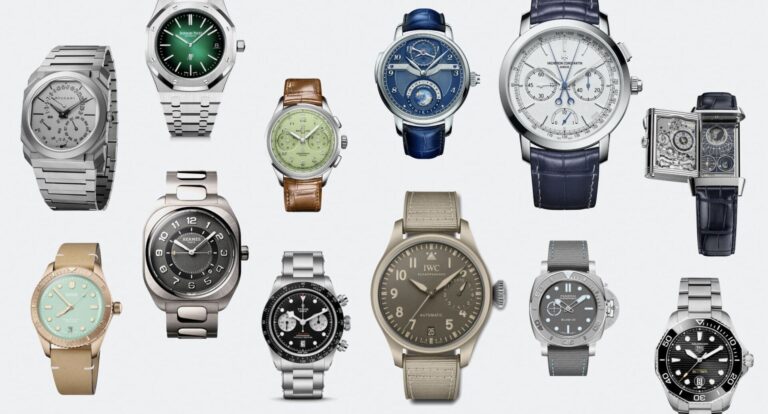
One of the most common pieces of advice given to watch shoppers is to go and see the watch you plan to buy in person before buying it. Not only to see how it fits on your wrist, but also how it interacts with real-life lighting and your eyes. In the online age, especially post-COVID, going to a store may not be practical or even possible. The next step is to find photos or videos of the watch so you can get a pretty accurate idea of what it will look like in your physical space. The only visual aid you’ll have is a digital rendering that offers little to no benefit.

The advancements in technology over the past 20 years have been astounding, especially in the area of 3D modeling and rapid prototyping. Just look at the quality of CGI in movies to see how far we’ve come. Similar advancements have been made in the ability to create 3D models in software and then export digital renderings or send them to 3D printers. For companies that manufacture physical products, the time from conceptualization to prototyping has been exponentially reduced, saving a ton of time and money. While digital renderings are certainly more technologically advanced than hand-drawn drawings and are a much more reliable reference for companies, in a consumer context, they are simply not as useful.


Just as prototyping techniques have improved, so has access to good product photography. Small businesses can take the perfect photo of their product with just an inexpensive lightbox or tent, some LED lighting, and a smartphone camera. If the DIY approach is so easy, what stops big brands from prioritizing photography on their product pages? Even if you have great product photos with artistic composition and interesting backgrounds, digital renderings are often displayed as the default image. This completely loses the appeal of the watch, making it look dull and lifeless no matter how high the quality. Just as a rendering of a human face can fall into the “uncanny valley” and become unsettling, you need to see how certain reflections are cast from a polished surface, not the amorphous grey blob that represents stainless steel.
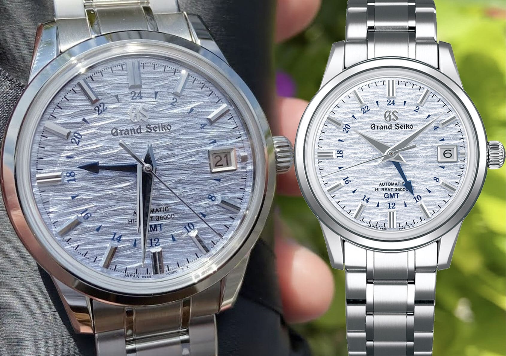

In my job as a writer for Time+Tide, I tend to see a lot of press releases and sometimes write “introductory” articles behind them before I have a chance to do a “hands-on” review. Obviously, there are time constraints when a company is developing a new watch, and copywriters are writing descriptions before a physical prototype even exists. To get around this, they sometimes use vague language to cover every point in case something changes along the way. The problem with that is that the digital rendering of the watch may be too vague to give away specific details like the texture of the dial, whether the hour markers are glued on or printed, or what material the bezel insert is made of. I won’t name names, but I once received a press release from a major Swiss brand that claimed the watch would have a sunburst finish, but then they released a watch with a completely matte dial, and that part of the review was wrong. Comparing a digital rendering to the finished product of that watch could easily be mistaken for two completely different watches, especially since it’s an established design where the only difference between the references is often the color and texture of the dial.
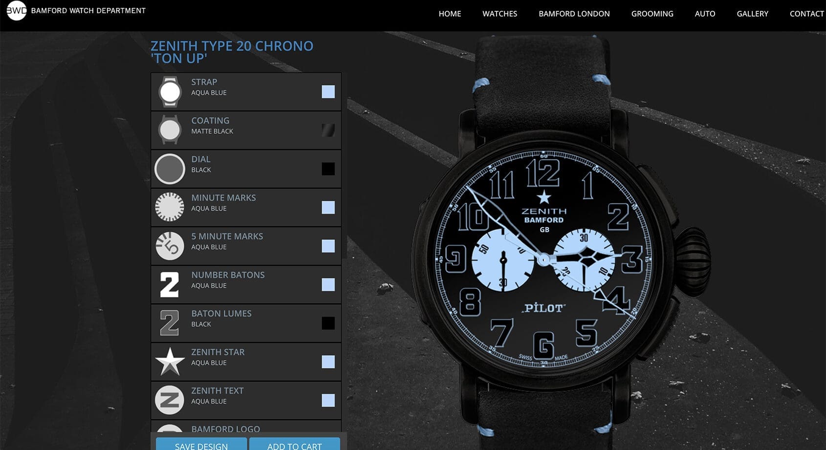

Considering that watch enthusiasts generally focus on fine detail, it seems odd that companies would resort to images that lack detail, fidelity, and life. Especially when it comes to actually great watches, digital renderings are at best useless and at worst unattractive. While digital renderings serve a useful purpose, they should never replace professional product photography.
