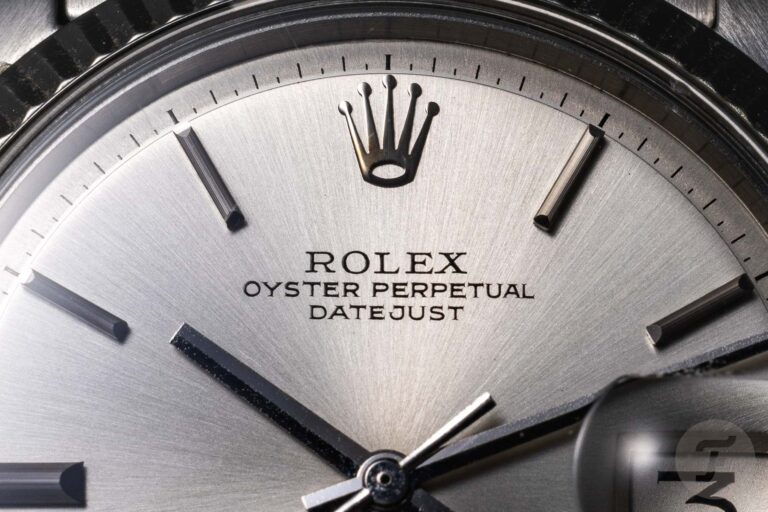
If you read my writing, you know that I’m an advocate of typography in watch design. This is an often overlooked element that can make or break a watch. As I was developing the watch, typography designer Samuel Baker came on my radar. We ended up collaborating and the result was a typeface completely bespoke for my new watch company. Samuel is very passionate about this subject and you can feel it right away when talking to him. So we thought there would be no better person to share their inside insights on typography with us.
We covered the basics of this topic in a previous article. If you’re new to the fascinating world of watch typography, you might want to start there before moving on to this interview.
How technical challenges affect typography
Let’s quickly explain how the types of dials change as technology advances. Again, this is based on information shared in previous articles on this topic.
Thomas van Straaten (TVS): How have the technical challenges affecting watch typography changed over the decades?
Samuel Baker (SB): We can talk in terms of centuries, not decades. The previously discussed pad printing process (also known as tampography or decal) has been around since the late 19th century and is still, at least in principle, the predominant method of printing on watch dials. Before that, most dial engravings were painted, enamelled, or engraved by hand.
Some dials used the cartouche technique (still sometimes seen today). This is like a small plaque with the manufacturer’s name and dial numbers engraved on it. However, these early hand-drawing and engraving techniques influenced many of the styles we still see and recognize as staples of watch typography. Especially since at first the metal plates (clichés) that trapped the ink were engraved by hand. It has the characteristic of carved letter shape.
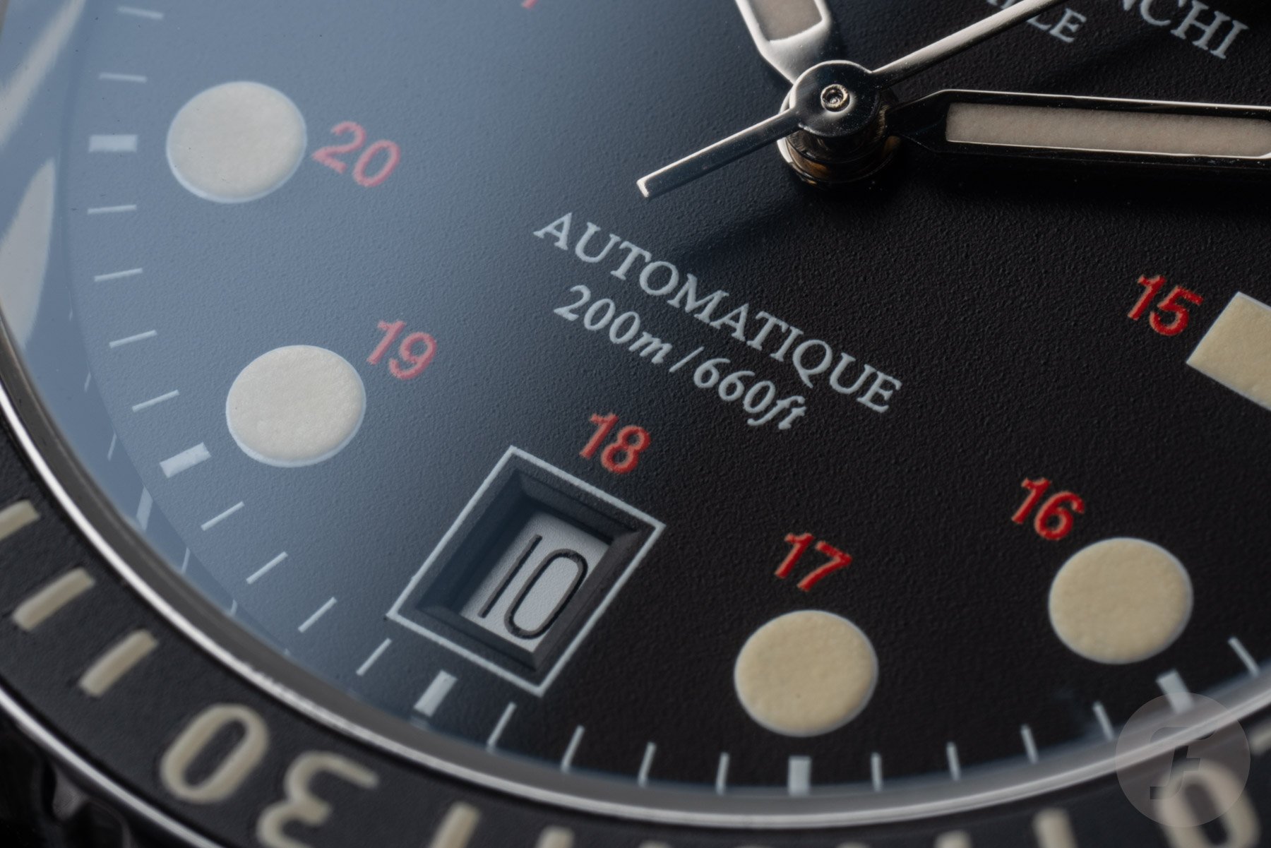
Later, chemical etching of these plates became the norm, followed by phototransfer of designs that could be scaled. This can drastically change the appearance of your character since you don’t have to draw them at 1:1 scale (which is very small on the clock). Scaling down makes the lines cleaner and sharper, and also allows you to composite multiple elements in more sophisticated ways. Nowadays, the artwork is created digitally and the plates are laser engraved. However, printing is still essentially done using an engraving plate and gelatin or silicone pads (except for cheaper digitally printed watches like Swatch).
In general, we can say that pad printing has become clearer and more accurate over time. However, it could also be argued that some of the individuality created by the imperfections and hand-drawn type has been removed.
How to read typography
TVS: How do you evaluate typography on watch faces? Let us guide you on what you are looking for.
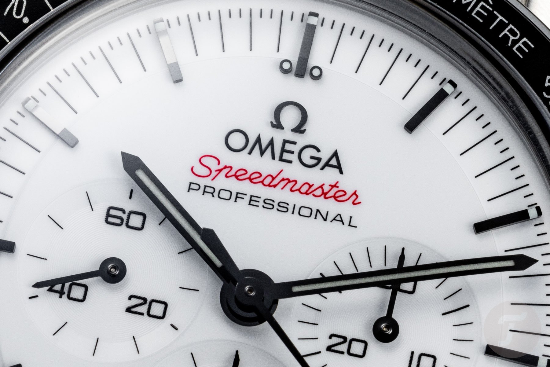
SB: If you can look at your watch without being distracted by clumsy print, that’s a good start. The typography must make sense within the overall design of the watch. If there are displays, subdials, etc., it should be clear what they mean and you should be able to read them. Basically, types exist to serve a purpose. After that, it’s a matter of execution. Is it beautiful, elegant, traditional, bold, innovative, stylish? What qualities is it trying to convey, other than just information? What is appropriate for the brand and the purpose of the watch? What does that say to you? Do you like watching? Does it evoke something you connect with emotionally? Of course, not all watches need to do this. Great functionality also makes for great design.
TVS: What is great watch typography to you?
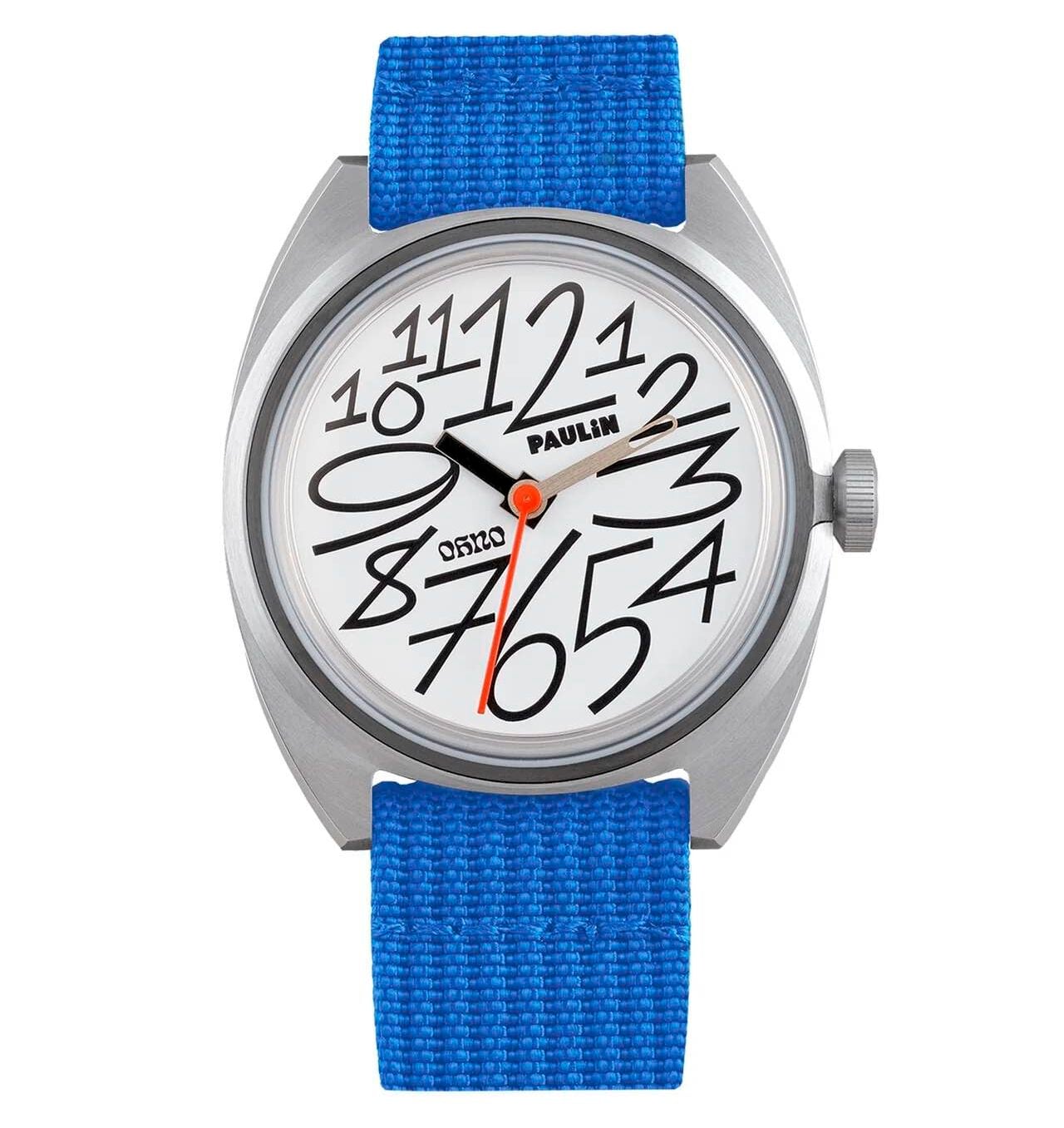
SB: Good watch face typography is like most other good typography. It should be easy to read, balanced, well spaced, and well laid out. You need to understand the context in which it exists. What I’m saying is that it needs to be appropriate. It doesn’t have to be timid or conservative (I think it can even be readable!). Sometimes it’s just fun or unexpected. You might find yourself smiling when you look down at your wrist. I love Pauline’s recent collaboration with California type foundry Oh No.
For me, it’s great when everything clicks and the dial layout “sings”. Very complex dials are very difficult to get right, but so are very simple dials.
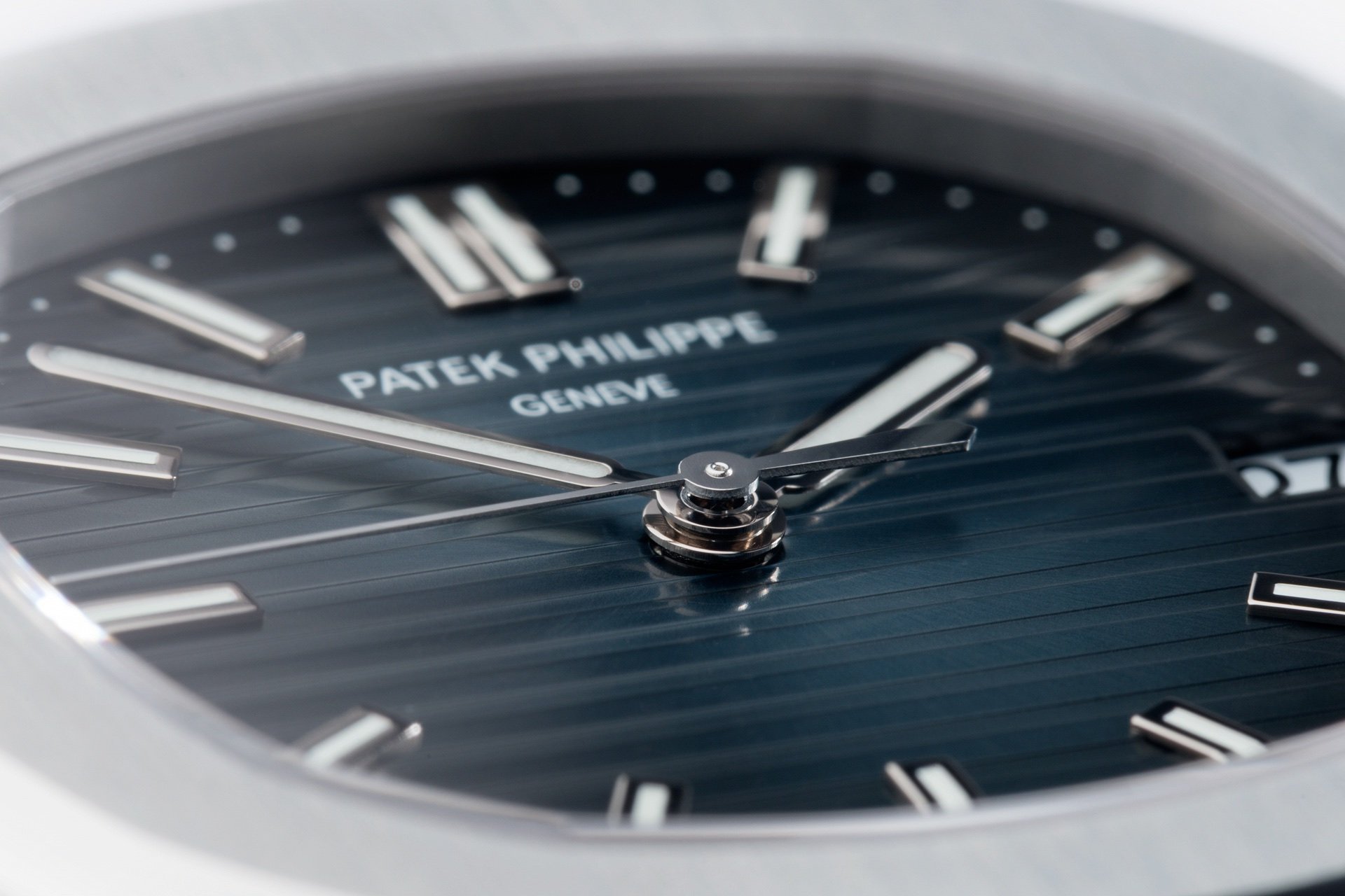
Image: Watch Club
TVS: What is bad watch typography to you?
SB: Lazy. When brands don’t care. When it comes to watch brands that use Arial on their dials, either they don’t care about the details or they can’t tell the difference. Neither looks good.
Another example of bad practice that we see all the time is digital distortion/stretching of type (usually pushing letters/numbers into certain spaces). Doing this messes up the stroke of the font, making the letters thicker in some parts and thinner in others. If you’re a typographer, that’s a real pain.

Image: Boulan & Sons

If you look at vintage Rolex date cars, you’ll see three different 2’s. One has 2, one has 12 and 21, and one has 20 left over. This is because we need to fill the date window to maximize the size of the numbers for readability. When drawn by hand, these two all have the same stroke thickness and curve feel. Just make it narrower or wider as needed (more like using a reduced or expanded font, but custom-made to suit your design’s exact requirements).
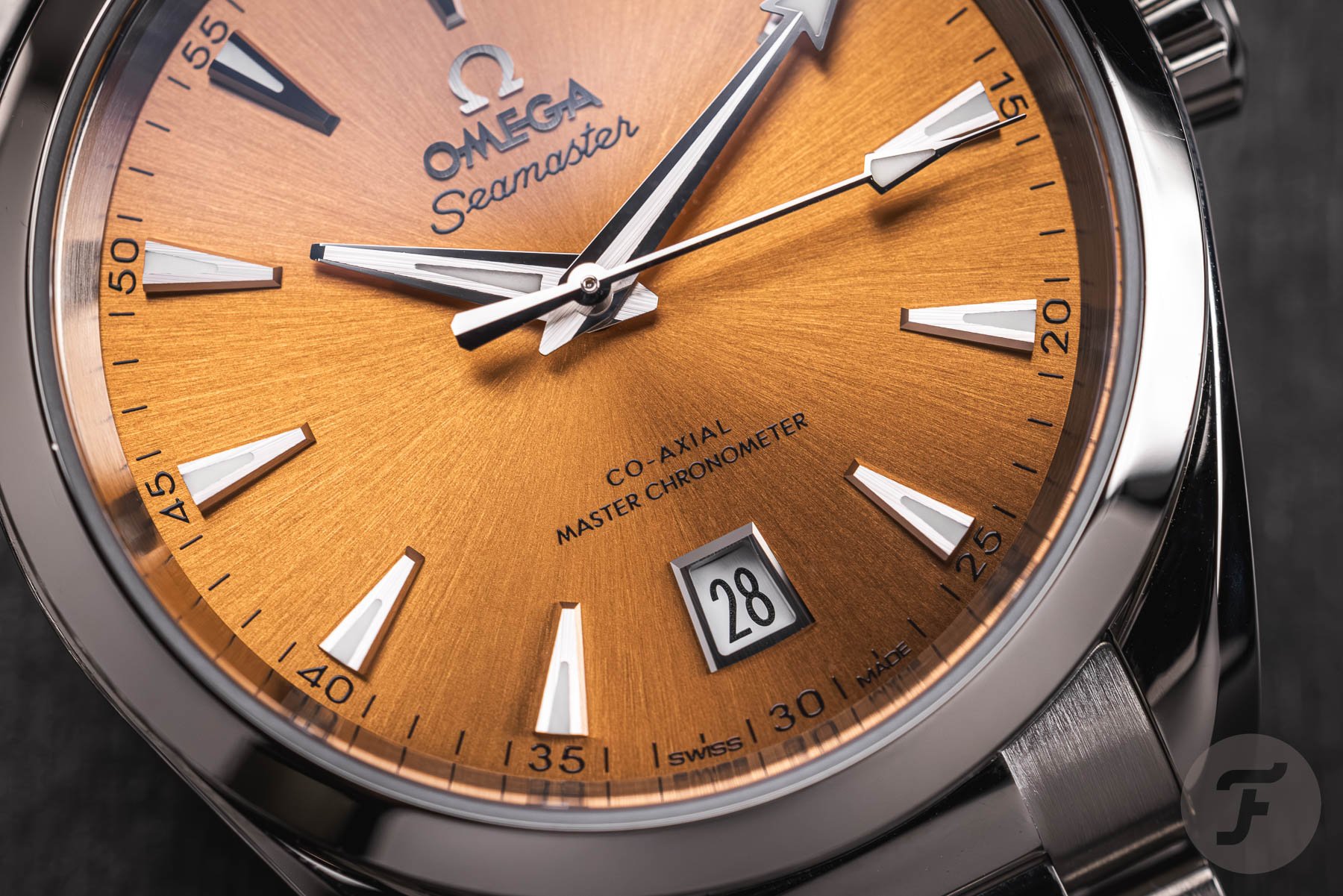
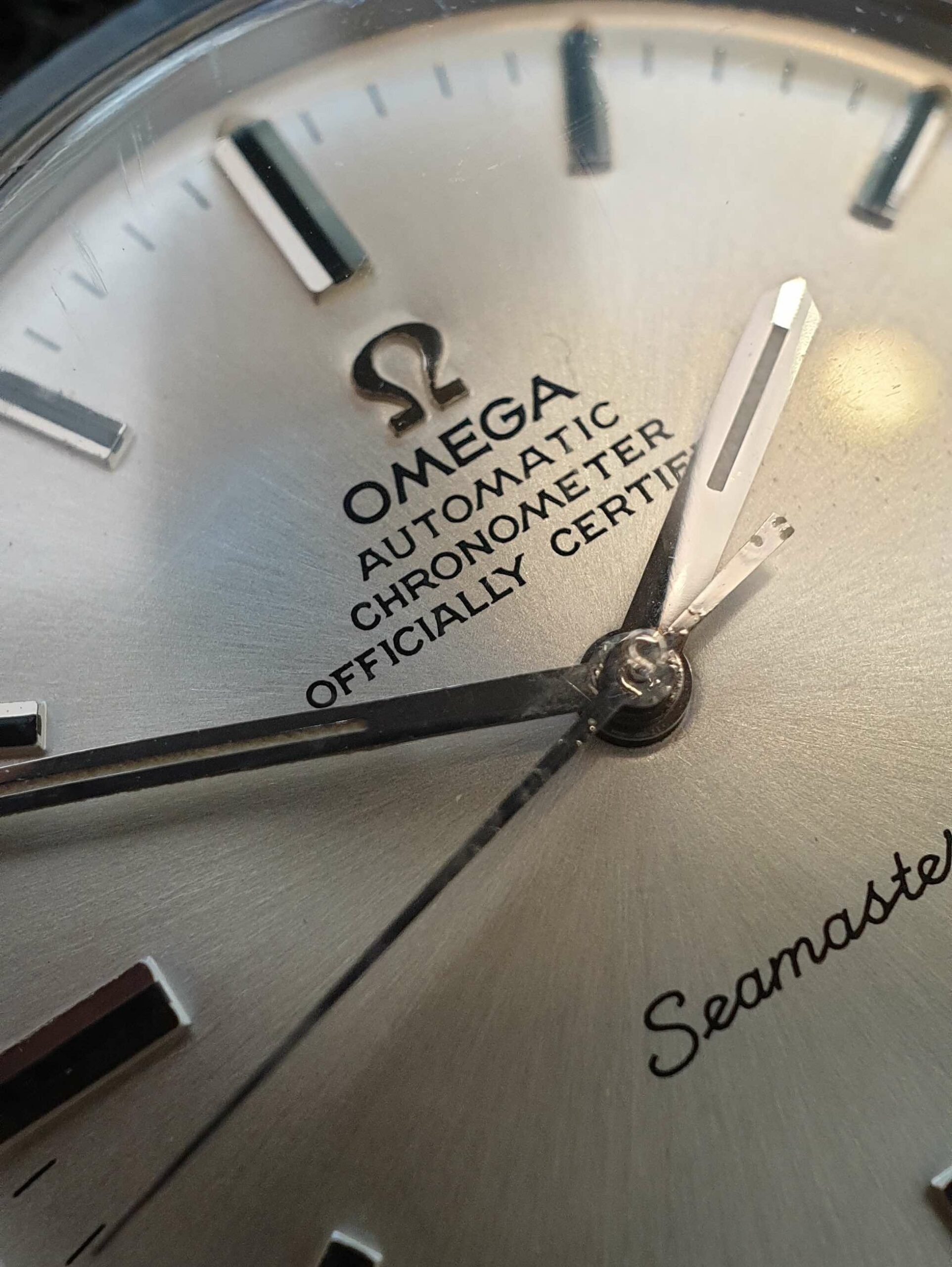
Most modern brands just require you to enter a number and stretch it to fit your window opening. An example of this is the tall date window at 6 o’clock on the current Omega Aqua Terra line. Omega uses a version of Futura, a classic modernist font, but distorting geometric shapes to squeeze in numbers is pretty jarring (at least to me).
Current typography usage
TVS: What would you change about the way brands handle typography today?
SB: I wish more brands would pay the same level of attention to typography as they do to finish, movement design, materials, etc. Hire an expert! The clock is incredibly detailed and intricate, with so many handcrafted elements. Don’t take shortcuts to type or use word processor fonts, especially if the font is front and center every time you look at the clock. It’s a shame that some of Patek Philippe’s finest watches have “TOURBILLON” written on their Arial dials. The exquisite quality of some of Patek’s vintage Stern flail dials gives the impression that they have lost their connection to watchmaking craftsmanship.
I think a lot of young brands, microbrands, are really good at design and typography. These brands are often founded by people with a great sense of design and aesthetics. And if you’re a micro-brand and don’t design your own/in-house movements or have a 100-year brand heritage, design is one of the things you can compete with.
Heuer Cortina — Image: Watchurbia
TVS: Can you tell us about some watches that highlight typography?
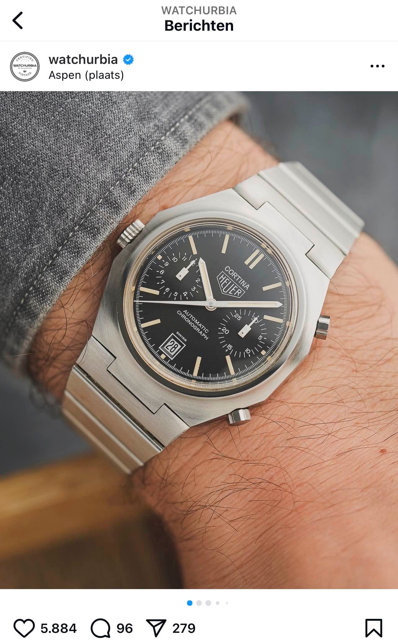
SB: I saw this incredible Heuer Cortina on Instagram the other day. All type is hand rendered and beautifully placed. Visibility is excellent, and you can feel the sense of detail in the details. Perfect execution.
In terms of modern watches, the custom numerals on the Berneron Mirage 38 are a great piece of work, really sophisticated and consistent with the watch. Nivada has managed to create a vintage revival without ruining the vintage type. I would also like to mention the Grand Seiko SBGE285 and -283 GMT. The brand has developed a new numerical typeface for the 24-hour bezel. Of course, it’s heavily influenced by the 5-digit Explorer II, but it’s well executed and blends perfectly with the overall design.
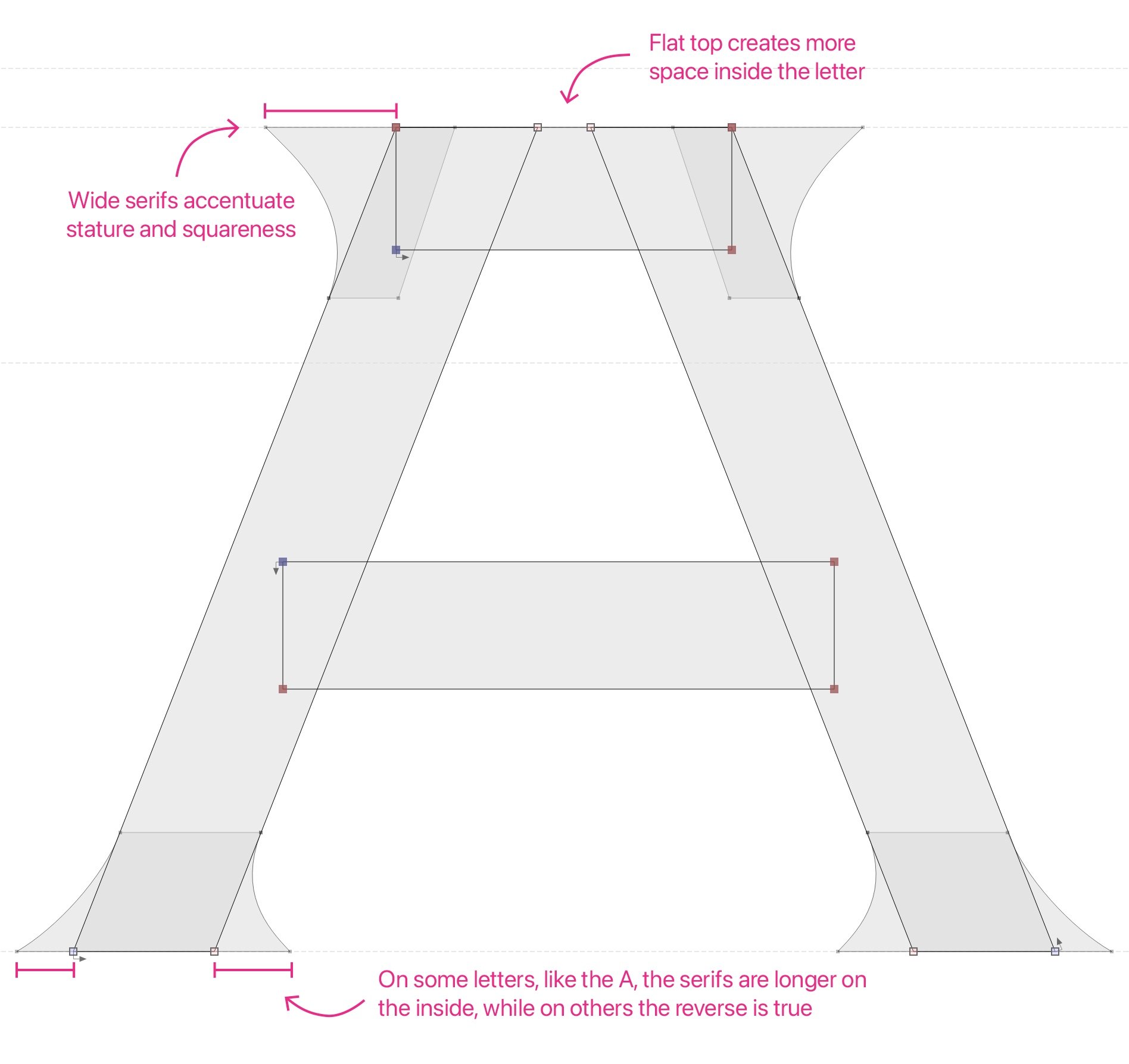
Custom Venustas typeface example for VPC
watch design type
TVS: How do you approach designing a new typeface for a new watch? How do you translate your brand and design into type?
SB: We start by discussing the values of the brand and the goals of the watch. That could include a mood board of what the brand likes and dislikes in other watches and other design areas. Sometimes you want a very vintage feel, other times it’s more modern, and sometimes it’s a combination of the two.
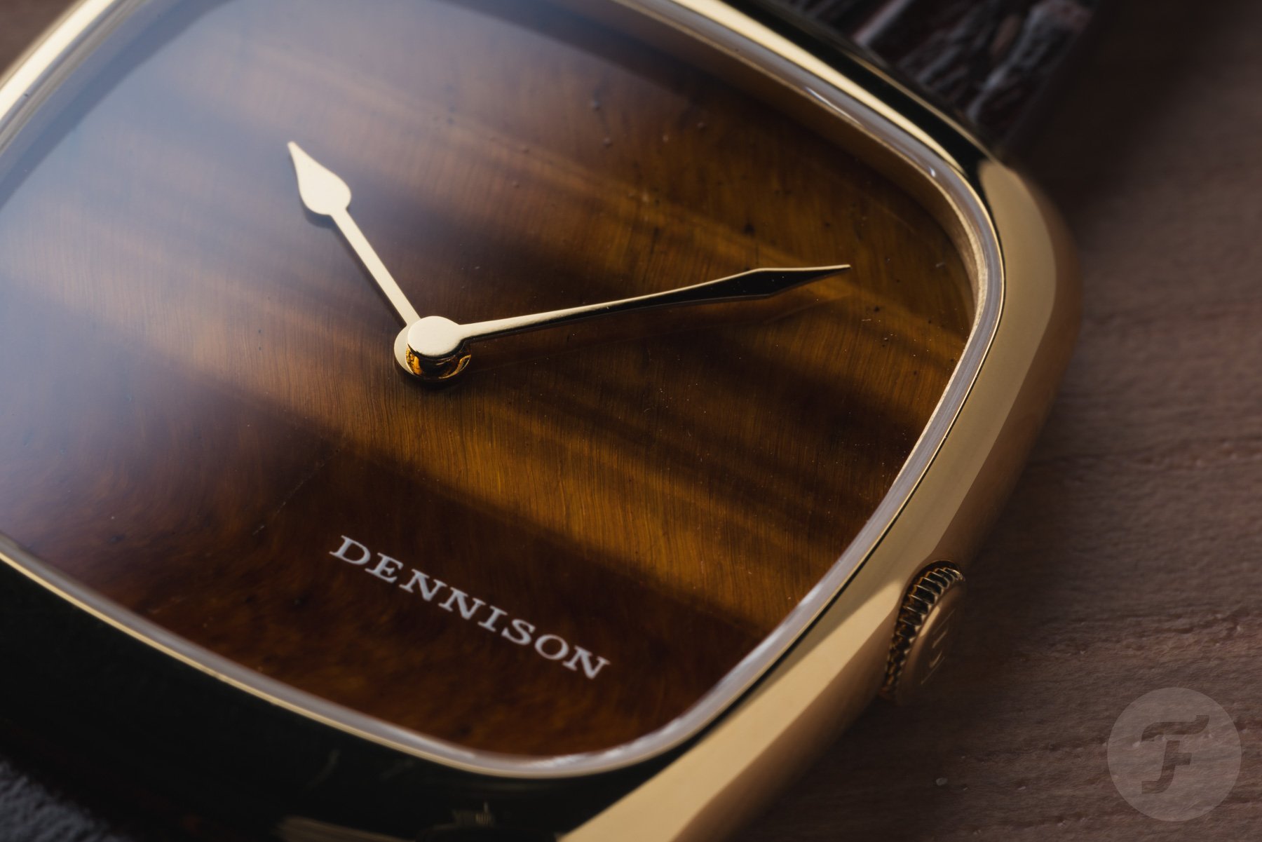
The idea of “classic design, modern construction” is currently very popular. People don’t necessarily want vintage replicas. They want modern performance and reliability, but a classic or timeless look in their designs. So it’s important to find a run that meets that brief. There are certain cues you can add to your typeface that instantly evoke a particular design language or era. Changing a curve or the end of a stroke can make something look decades old or more modern than it was decades ago. It’s important to balance it until you get the right look and feel. Most of the time, it’s just about arriving at what feels right.
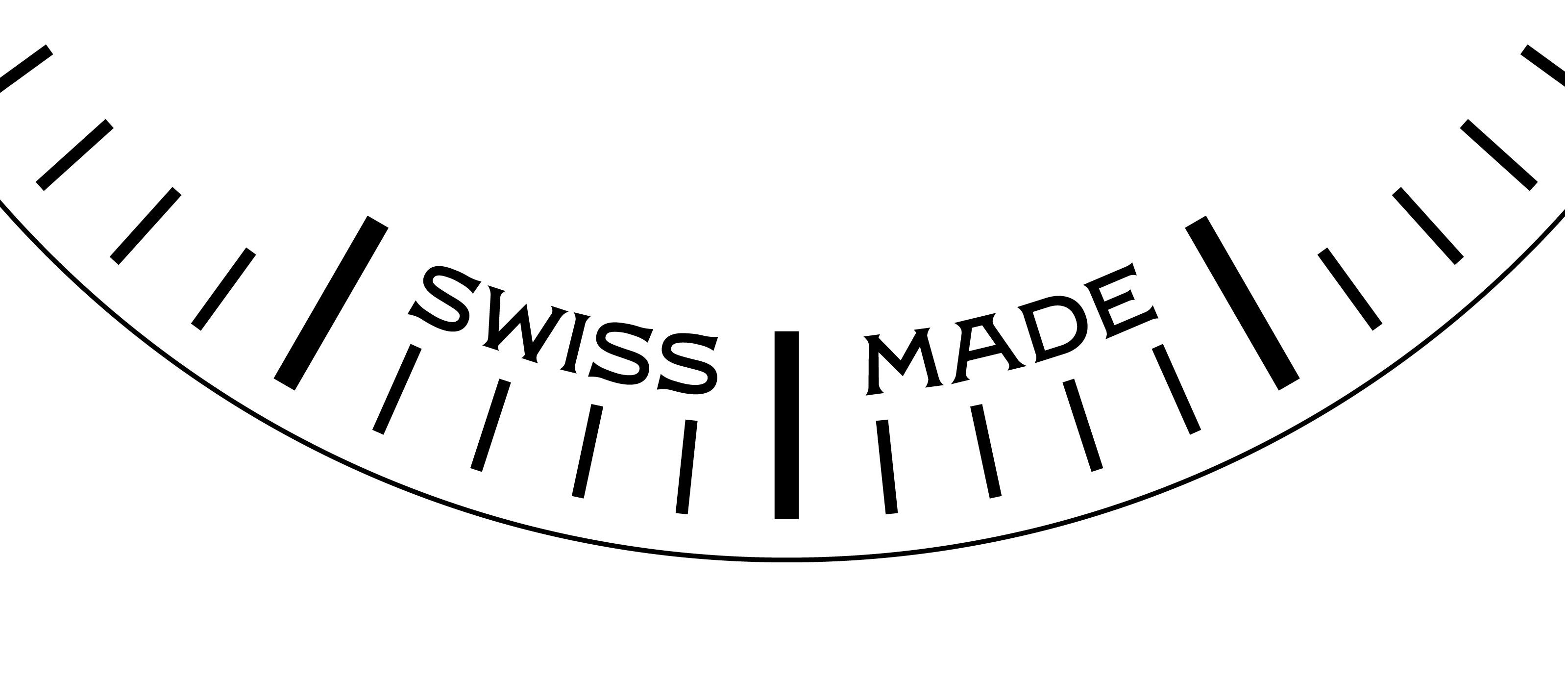
TVS: What about typography beyond the dial? Do you have any thoughts on the bezel, case back, etc.?
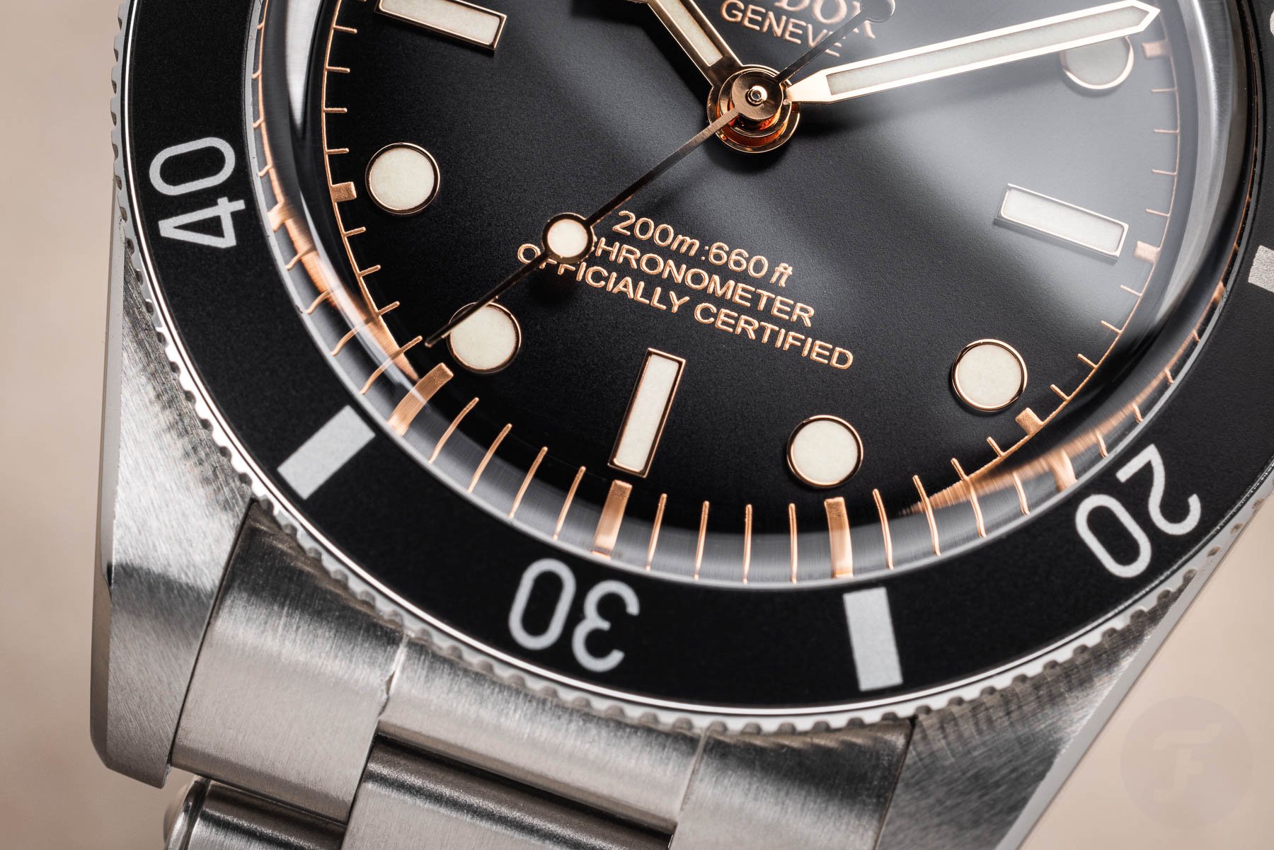
SB: Bezels are interesting because they are often the largest type on a watch. In the case of a diver’s watch, its typography is critical to its functionality and can even be life-threatening in certain situations. It’s certainly a different approach than just writing “Swiss Made” as small as possible at the bottom of the dial.
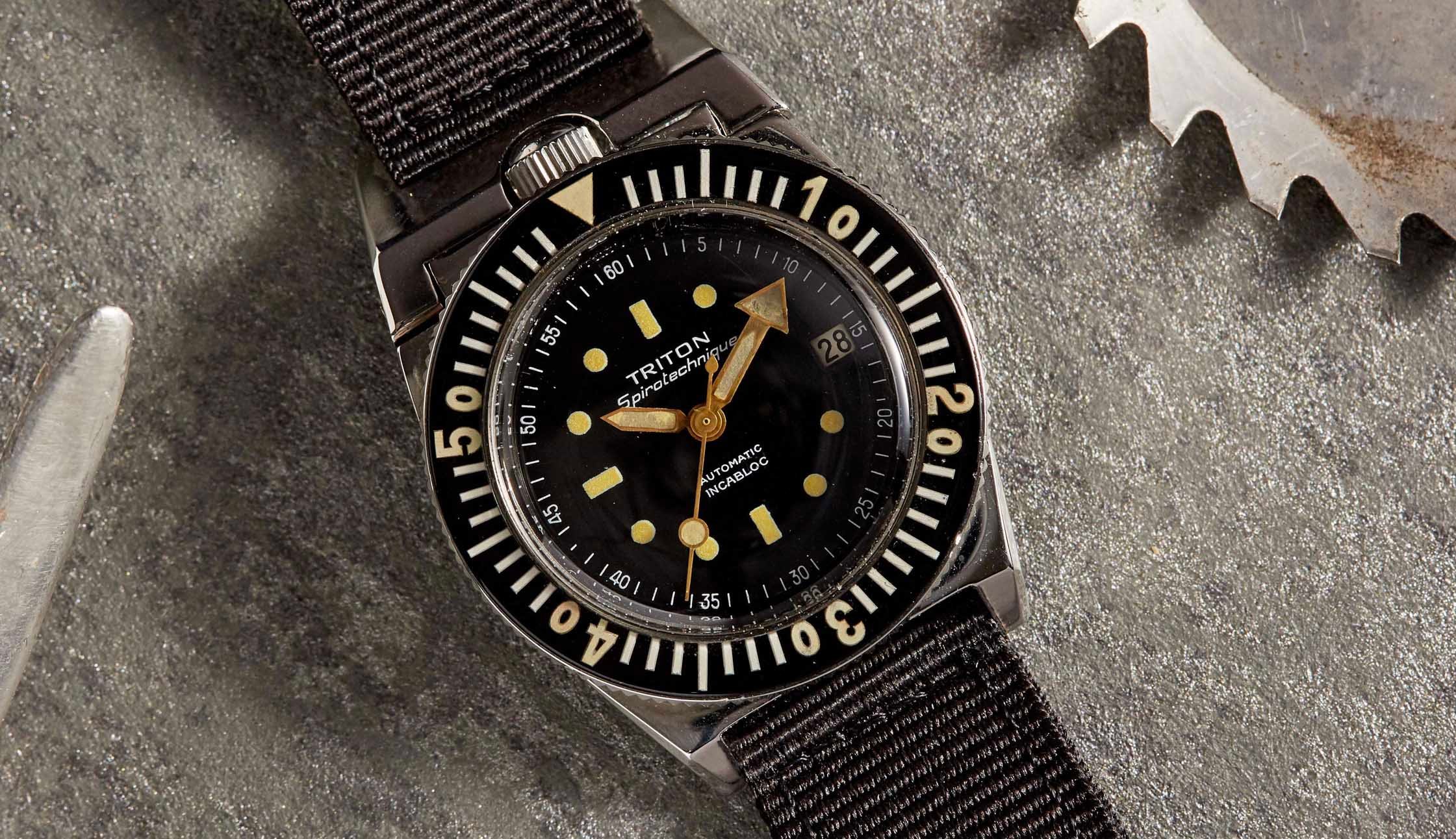
Image: Analog: Shift
There are also issues with various materials and techniques. The bezel is not pad printed. Markings are typically anodized, engraved, or molded in ceramic onto the aluminum insert. This changes some of the style requirements. You don’t have to deal with ink spreading, but you do have other challenges that often change your style. The same goes for the case back. Traditional case back engravings, unless hand-carved, are often monolined or without serifs. Traditionally, we design for the application and manufacturing process.
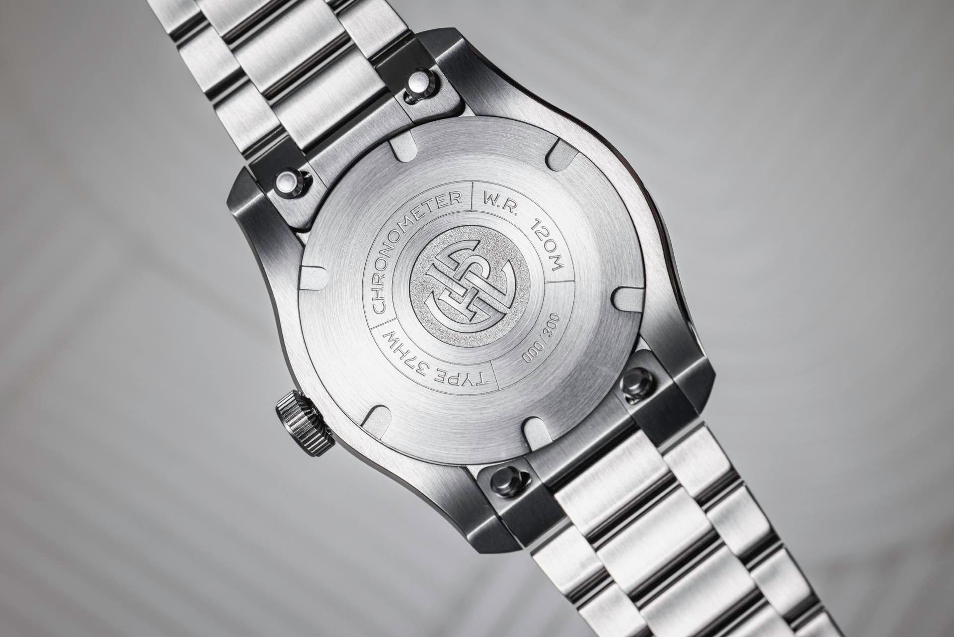
However, it was interesting to see that the VPC font was applied to the back cover design of the Type 37HW. I expected it to have to be slightly altered due to the engraving process and the curvature of the letters, but it turned out very nicely with minimal adjustments.
TVS: Is there anything else you would like to mention before we end?
SB: I would like to thank you for the opportunity to talk about this. We know that watch typography is a niche of niches. Surely it’s not the most important thing in the world, so I’m just glad someone brings attention to it!
Summary about typography
Of course, Samuel is right that this is a niche of niches. Still, I feel like this doesn’t fully understand the subject. I like how he points out the importance of design and craft in watchmaking. If a brand celebrates hand chamfering and guilloche work, why not also celebrate hand lettering and type design in general? In my opinion, the impact is just as significant.
Thank you to Samuel Baker for taking the time to answer my questions. Hopefully we can give this subject a little more prominence in the overall horological conscience.
What are your favorite and least favorite watches in typography? Let us know in the comments below.
