Car-inspired watches can be a bit of a minefield. There are a lot of tedious attempts to reach a broad demographic. But unlike the logoed quartz wall clocks you stare at while waiting for your car to be serviced at a brand dealership, or the same-sized watches worn by the store managers, some brands are doing it well. For me, the key is a good design that is subtly inspired by the brand or car model, and doesn’t take it too literally. Less is more. Less is always best.
Big logos on the dial are a no-go for me. The prancing Ferrari horse is iconic, but I don’t want it on the dial. The understated cool I’m looking for is that the association with the brand isn’t overly obvious. Great watch design is good enough on its own, but with the right touches, a unique collaborative identity can elevate a great design. Think a sports chronograph that represents a racing team with a single accent color, or an Easter egg that uses a skeleton logo as a counterbalance to the seconds hand. I’m not a big fan of wheel-shaped rotors that cover the movement.
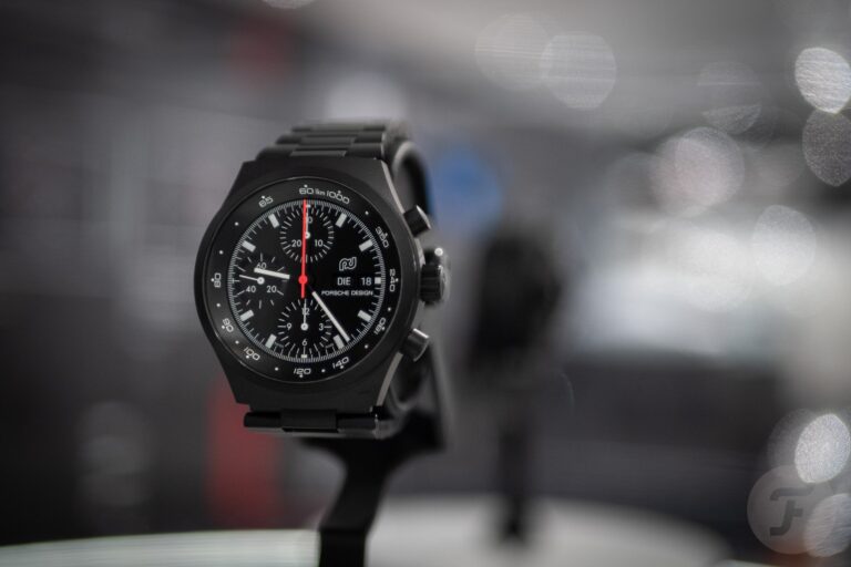
Porsche Chronograph 1 75 Jahre Porsche Edition
Every Porsche Design watch is clearly associated with it, right? The answer is yes and no. The company has been separate from the automotive industry for many years, but it still falls under the same umbrella. Of course, many of the buyers are Porsche owners, but the understated coolness is still unique. At least for me, and these are some of the few all-black DLC watches I like. The German-inspired, simple design of the dial and the pure instrument feel used to make me feel like I was wearing a Porsche speedometer on my wrist. But in today’s touchscreen world, this is changing. I’m not a big fan of black watches, but when it comes to Porsche Design, it’s the only right choice, and the Chronograph 1 is a great starting point. If you’re going to spend nearly 10,000 euros, it has to be good. And it starts with the COSC-certified caliber WERK 01.140.
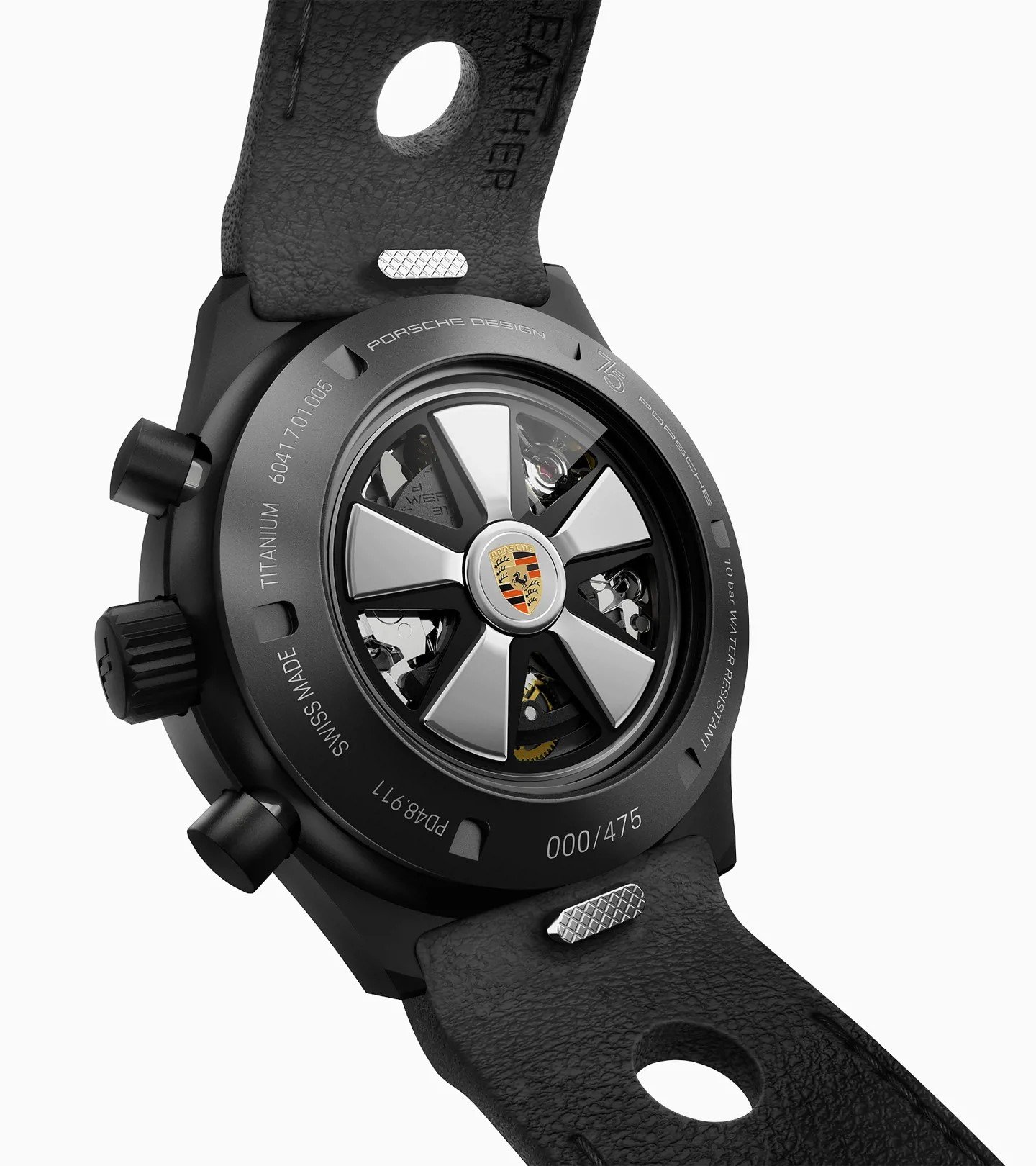
The black DLC coating on the 40.8mm case is supremely sturdy, and I love the red and white accents on the sturdy-looking NATO with articulated end links. I say NATO, but this is a leather-covered one by German strap engineering. The dial has the obligatory red seconds hand at 12 o’clock and typical textbook chronograph legibility. Porsche Design has its characteristic smooth cushion-like case, and it has everything you need except for one small detail. Flip it over and the movement is covered in a perfect reproduction of a Fuchs alloy wheel for the rotor. I love this watch, but this detail makes me want to modify it. It’s too much, too literal, and a bit kitschy. Otherwise, for €9,975 you get a great black chronograph with plenty of pedigree.
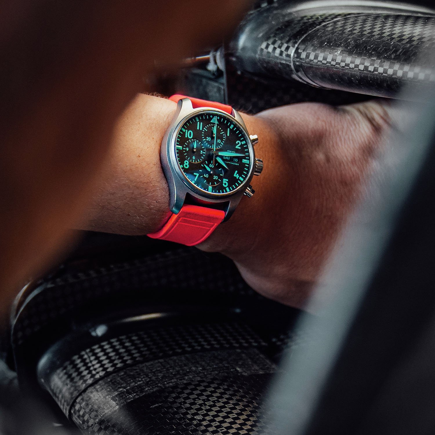
IWC Pilot’s Watch Chronograph 41 Mercedes-AMG Petronas “Miami Pink Edition”
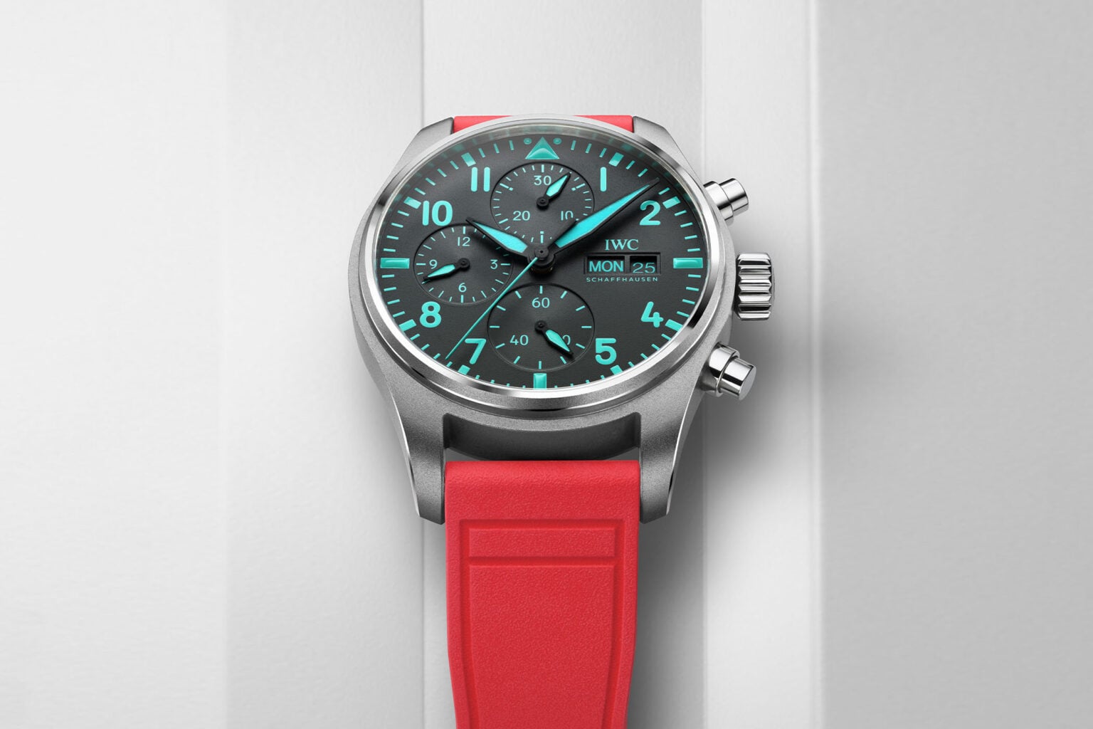
This IWC is perhaps one of the best examples of a secret collaboration. You’d never guess the connection, except for the bold touch of turquoise, of course. Those who know, will. Petronas’ smash pop of summer freshness subverts the ultra-tool watch vibe of the 41mm Pilot’s Chronograph. The capital “F” adds fun and appeals to the fashion-conscious crowd. Now, if you love aviation instruments on your wrist and are sick of bright teal color pops and hot “Miami Pink” straps, we’ll have to agree to disagree.
The element of surprise
Maybe this isn’t for you, but the 41mm pilot chronograph in lightweight titanium opens new doors for the brand and is very cool. I can easily imagine Lewis Hamilton having a hand in the design of this watch. It matches the crazy casual fits he’s been wearing in the paddock and pit lane this year. The bold shade of turquoise doesn’t take away from the appeal of this very well-made chronograph, but for me it adds to it. The hot pink strap makes it even more appealing. I’m still excited about the 41mm size because, despite being 14.6mm thick, it’s more wearable than a similarly sized 43-46mm watch. It’s powered by IWC’s in-house caliber 69385, and the 9,000 euro price tag is fantastic.
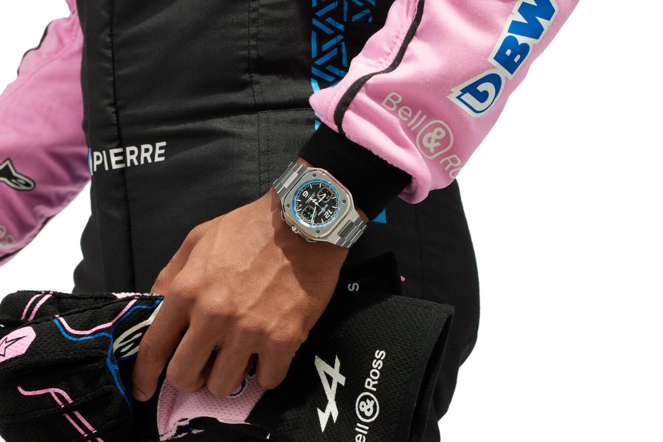
Bell & Ross BR05 Chronograph A523 x Alpine F1
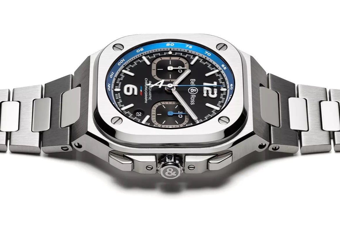
The Bell & Ross BR05’s cheeky, angular shape and integrated bracelet seem to divide opinion here at the Fratello office. I love some of the variations, but this time it’s a more understated take on the French racing vibe. Bell & Ross has history with the Renault F1 team, which morphed into Alpine F1 and brought us the elegant French racing blue. While I miss the lemon yellow and black sparkle a bit, the new colorway brings an understated appeal to the 42mm A523 Chronograph.
A subtle touch
The rounded rectangle of this BR05 may still feel a little too big, but it’s worth it. This BR05 is an evolved textbook example of how a four-wheel racing collaboration can be realized. It has a strong understated, even tailored chic, which is probably because Bell & Ross is French (although it is manufactured in Switzerland). If you’re not a car or racing enthusiast, you’ll find the seconds hand a nice detail, but for me, the big Alpine “A” is instantly recognizable. That’s why this blue-tipped pointer is my favorite part of the dial, matched with the steeply angled blue Rehaut tachometer. The blue pointer on the 30-minute counter and the subtle French tricolor above 6 o’clock make for a well-made and attractive package at 7,500 euros.
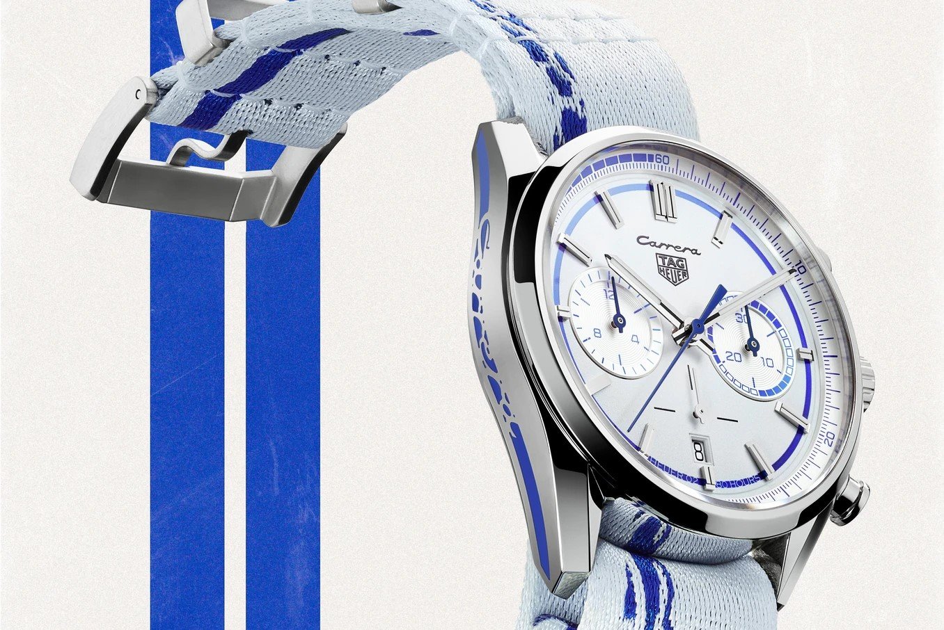
TAG Heuer Carrera Porsche RS 2.7
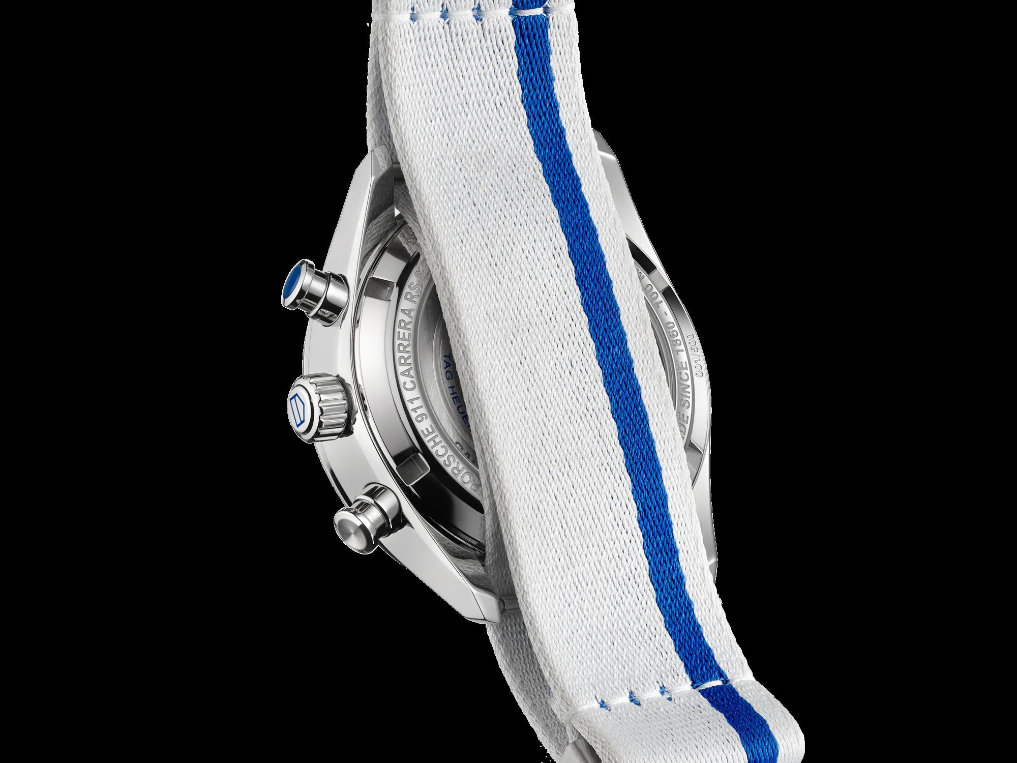
We move from Easter egg details and French chic to Tag Heuer’s longstanding relationship with racing and Porsche. I’m a big fan of the 39mm Carrera reissue, which has the same case shape but is a bit larger to suit a wider audience. I’ve taken a more liberal stance on size recently, so this compromise is easily acceptable, but is the Porsche influence too strong? As a 50th anniversary commemoration of the legendary RS 2.7, the Rennsport features plenty and I love the very crisp white dial. I could do without the blue Carrera logo on the left side of the case, but it still looks good. For some reason the NATO strap doesn’t suit me, so I’ll go for the steel bracelet option.
Too many Porsches?
If you are a big Porsche fan, by all means, choose the white NATO case with the Porsche logo and blue Carrera lettering, but for me, it seems a bit too much. The dial neatly features the Carrera lettering at 12 o’clock. Some may find this unsurprising, as it is reminiscent of the Heuer Carrera, but this is the Porsche Carrera logo. This is the first time that this connection has been used so literally by TAG Heuer. The dial offers a fresh contrast, and I am a big fan of the “fake” twin register look, where the small seconds register at 6 o’clock is so minimal that it doesn’t look like a triple. Yes, TAG Heuer, I have come to like this watch and can imagine myself wearing it on a bracelet. With the Caliber Heuer 02 and an 80-hour power reserve, the full package is a bargain at 7,900 euros.
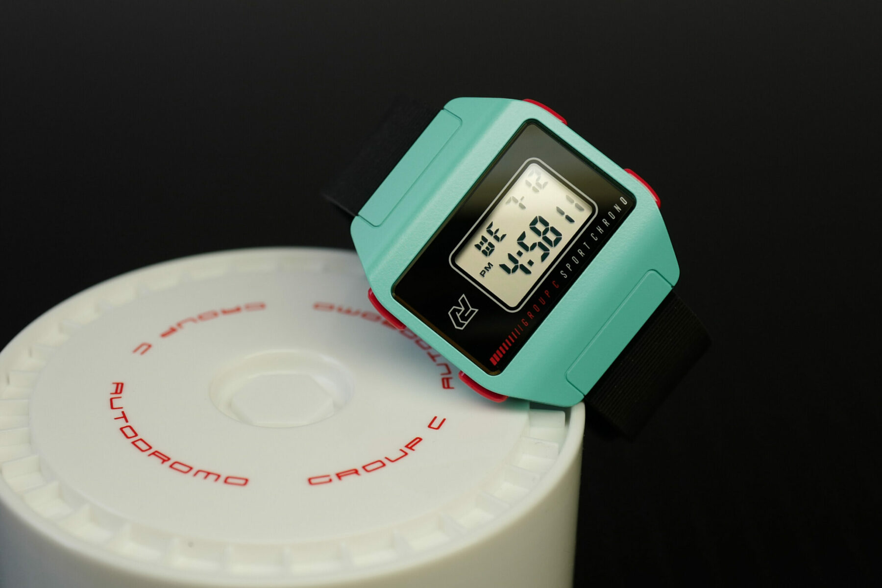
Autodromo Group C
Autodromo taps into the pure atmosphere of car racing. They shape their watches from the sense of speed and the smell of gasoline, rather than overly verbalizing it. The Group C collection is a perfect example of relevance without being literal. The Group C digital watch comes in turquoise blue, an alternative lemon yellow, and more in its fourth iteration. And it’s a nicely sized 36mm case with red pushers and logo screen detailing. The simplicity rivals Casio. Cerakote is a durable surface, and the strap? An 80s-style finely ribbed rubber that’s reversible and made from comfortable FKM (fluoroelastomer) rather than dust-sucking magnetic silicone.
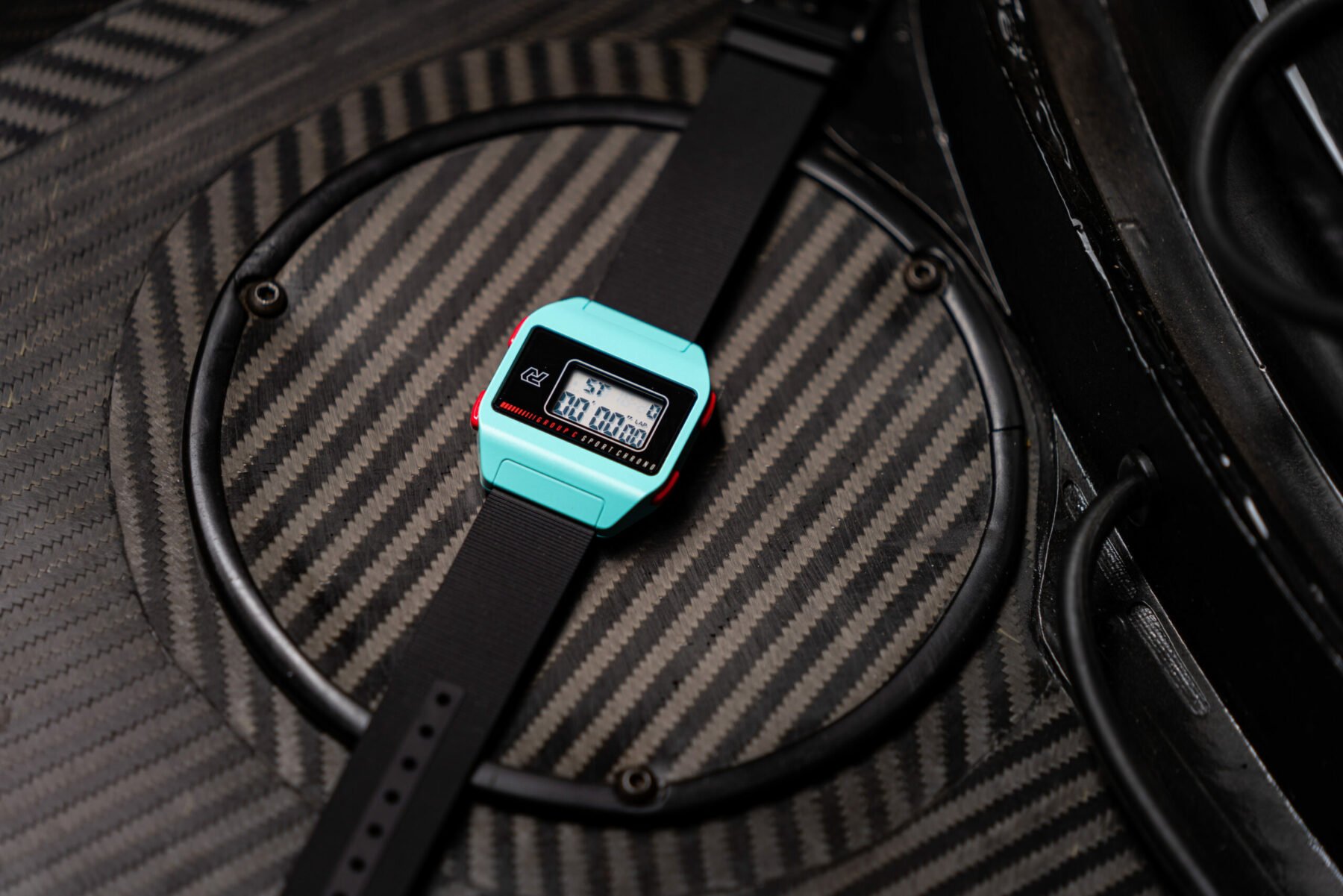
Slim at 10mm and heavy (for a digital watch), the Autodromo Group C is in a class of its own. To be honest, I know some great microbrands that are all about retro love. But they’re not digital, and a tough digital watch with a steel case and tough Cerakote in a summery color is unique. 510 euros is a lot for a G-Shock, but one look at it and you get the vibe. I can picture myself buckled up in a Group C Porsche 962 with a fire-breathing engine two inches behind me, taking lap times. I love G-Shocks, but this watch tickles my 80s-born palate like crazy. The Group C has the pure 1984-brand-new appeal, but with today’s quality control, reliable electronics, and crisp display. The Group C is a lot of fun, and as far as I know, it’s the only digital watch with an AR-coated sapphire crystal, which makes it a real treat.
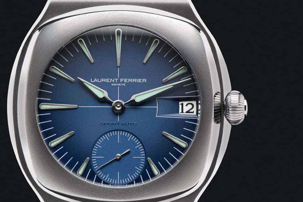
Laurent Ferrier Sport Auto
We finish off with a side-on look at the Laurent Ferrier Sport Auto car-themed watch. We’ve covered this masterpiece before, but don’t look for any hints of cars here, as it would be futile. This exquisite Sport Auto is a rather chunky yet refined rendition of the classic shape of an integrated bracelet sports watch. You’ll notice that the distinctive hint of the Assegai spear hand is now wider and more assertively styled and coated with pistachio green lume. Long, thin applied indexes seem to reach out to touch the hands, and a crosshair is painted on the gradient dial, almost salmon pink. At nearly €50,000, it competes with Pateks, but the bold grade 5 titanium case and blocky soft bracelet give it a different vibe.
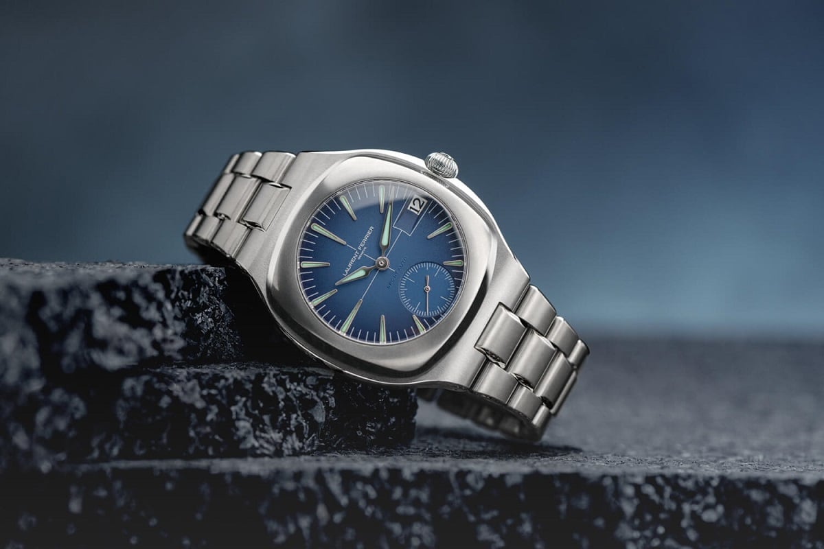
Unobtrusive Link
So why is the Sport Auto, like the other watches in this story, so car-centric? Ferrier has a history of racing at Le Mans, where he was a top endurance racer. The curves of racing cars inspire the rich mid-blue dial. Perhaps the Porsche 935, in which he and his partner François Servanin shared the podium? While cars and racing heavily influence the case, the delicately finished Caliber LF270.01 micro-rotor movement remains a hushed secret until you turn the case over. Its 41.5mm diameter is a perfect fit for the soft cushion case, and it can be purchased for CHF 46,000 before tax. This is entirely Patek territory, but I’d take the lighter, softer-angled Sport Auto over the more conventional Nautilus any day.
Did you line up on the starting grid, Mr. Fratelli? Or are car-themed watches just a no-no? Me? If my budget allowed, I’d wear a few of these watches, especially if they didn’t have any obvious car or racing ties.
