Seiko’s Prospex line is growing fast, and it’s not just about diver’s watches. Following the announcement of the new Marinemaster last week, two new Speedtimer chronographs have been introduced. The new SRQ051 and SRQ053 may look familiar, as last November saw the release of two Speedtimer models inspired by the same 1972 Seiko chronographs as these watches. The first (SRQ047) featured the popular panda dial, and the second (SRQ049) was a limited edition with a reverse panda dial. The two new products announced today also feature a reverse panda dial. Let’s take a look at how they differ from last year’s SRQ049.
The two watches, introduced last November, marked the start of the second series in Seiko’s lineup of contemporary premium mechanical Prospex Speedtimers. Fast forward to 2021 and the first watch to revive the Speedtimer name in the Prospex line was a stopwatch-inspired one. It was used at the Tokyo Olympics in 1964. I’m a fan of the limited edition Prospex Speed Timer SRQ035. The 1964 stopwatch has a distinctly clear presence.
A mechanical speed timer inspired by classic Seiko chronographs
Seiko has since released several Speed Timer models with quartz movements, but a second series of premium mechanical Speed Timer chronographs debuted last year. As Thomas explains in his article, these watches were inspired by the 1972 Seiko 6138-8001 (reverse panda) and 6138-8020 (panda dial). The modern versions combine ’70s inspiration with modern specifications, resulting in a series of great-looking watches with historical background.
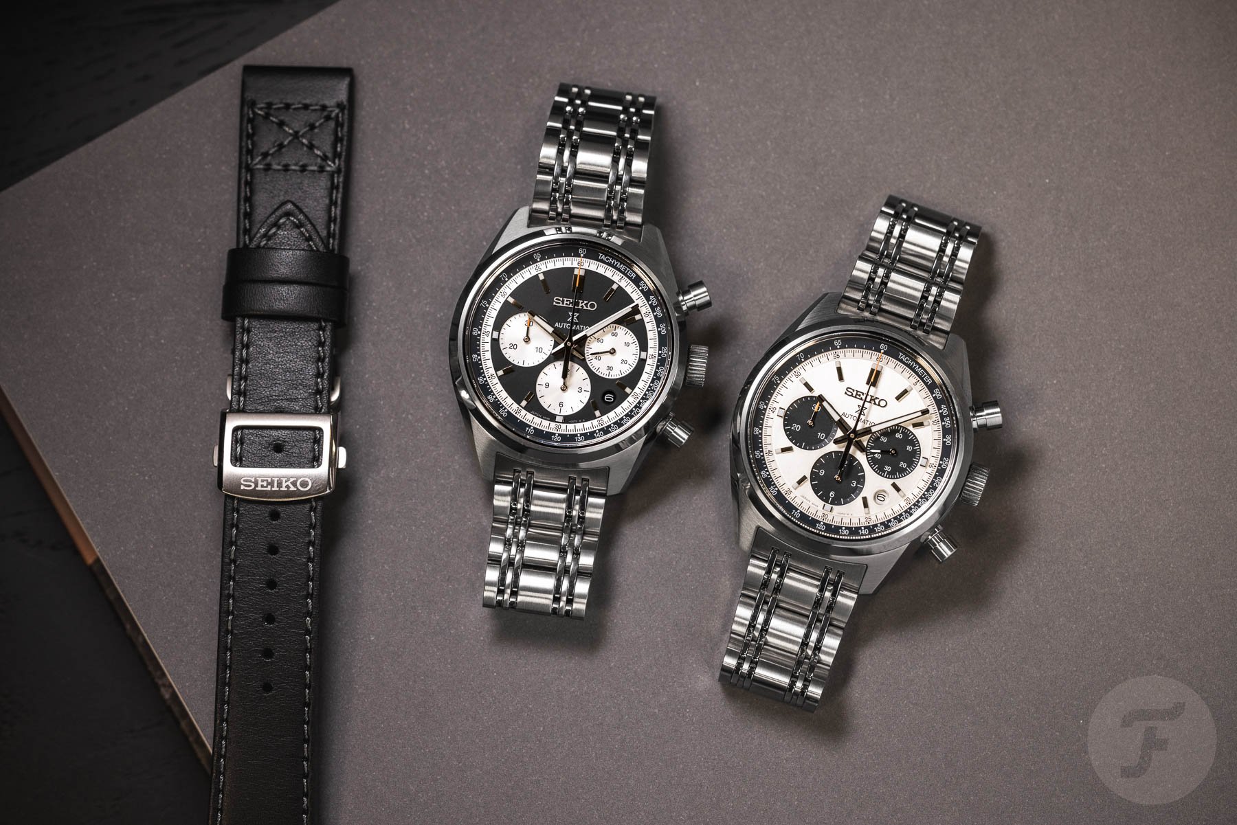
SRQ047 and SRQ049 debuted last year
As mentioned before, the regular production SRQ047 came with a panda dial, while the limited edition SRQ049 came with a reverse panda dial. The latter was to commemorate the 100th anniversary of the Seiko brand. The new models are the SRQ051, which features a beautiful blue reverse panda dial, and the SRQ053, which features a black reverse panda dial. And if you think the new SRQ053 and the limited edition SRQ049 look eerily similar, you’re not wrong.
Though they look the same at first glance, the dials are subtly different: last year’s limited edition had a dark grey dial with silver registers and orange accents on the chronograph hands, while the new SRQ053 combines a black dial with silver registers and red tips on the chronograph hands.

Specifications of Prospex Speed Timer SRQ051 and SRQ053
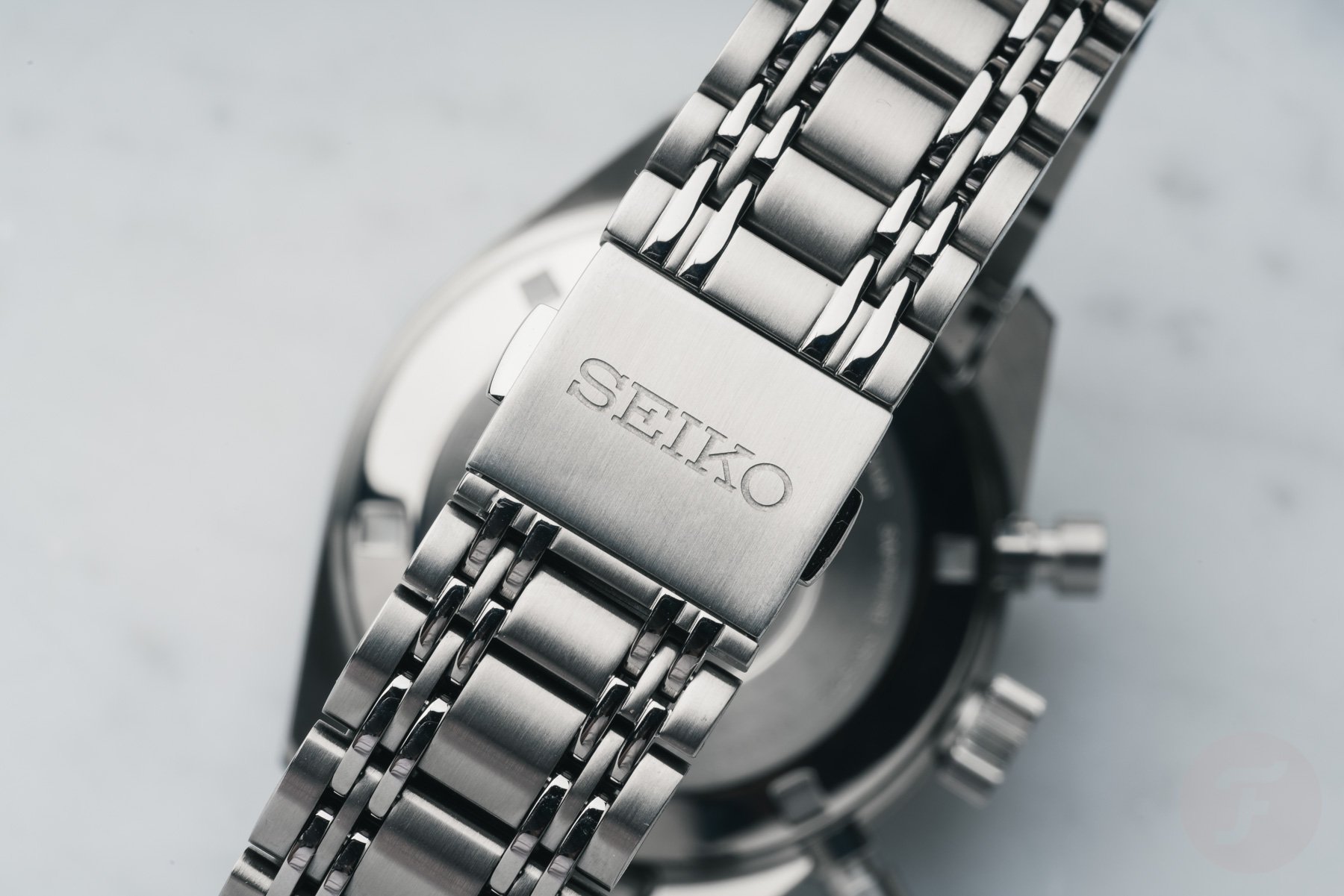
But let’s recall the basic specs of both watches. The SRQ051 and SRQ053 are made of hard-coated stainless steel, measure 42 x 49.5 x 14.6mm, and are water resistant to 100 meters. The watches come on the same hard-coated stainless steel bracelet as last year’s release. This nine-row bracelet has plenty of retro flair to match the style of the case and dial.
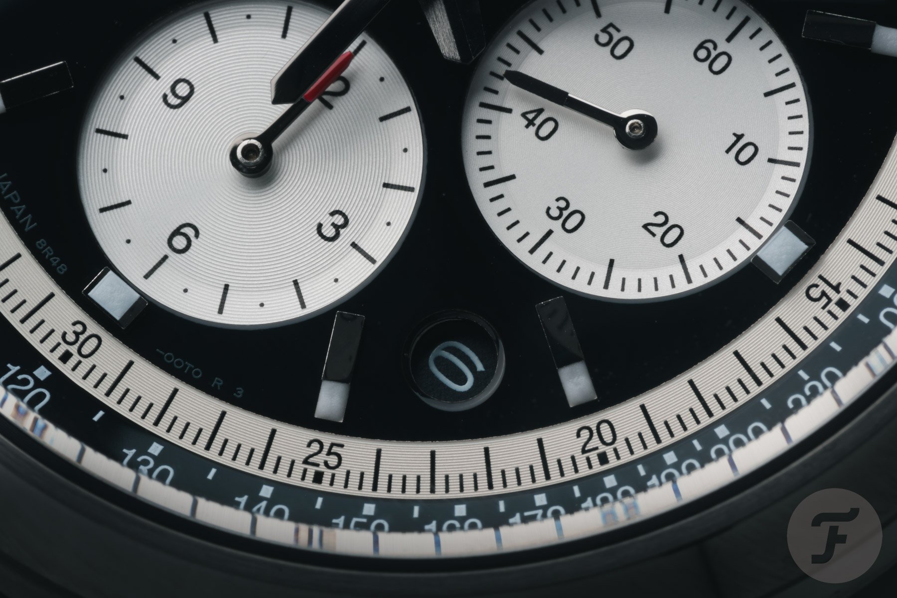
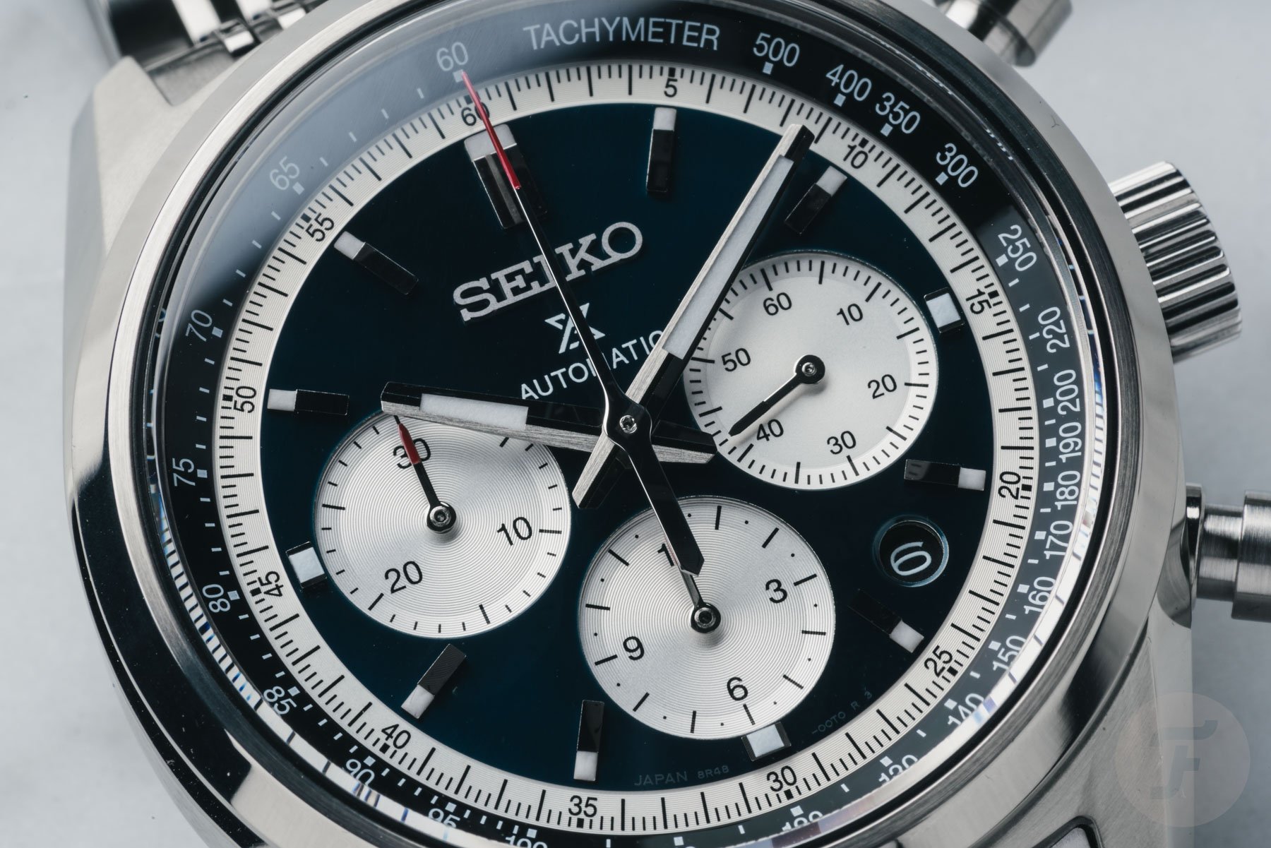
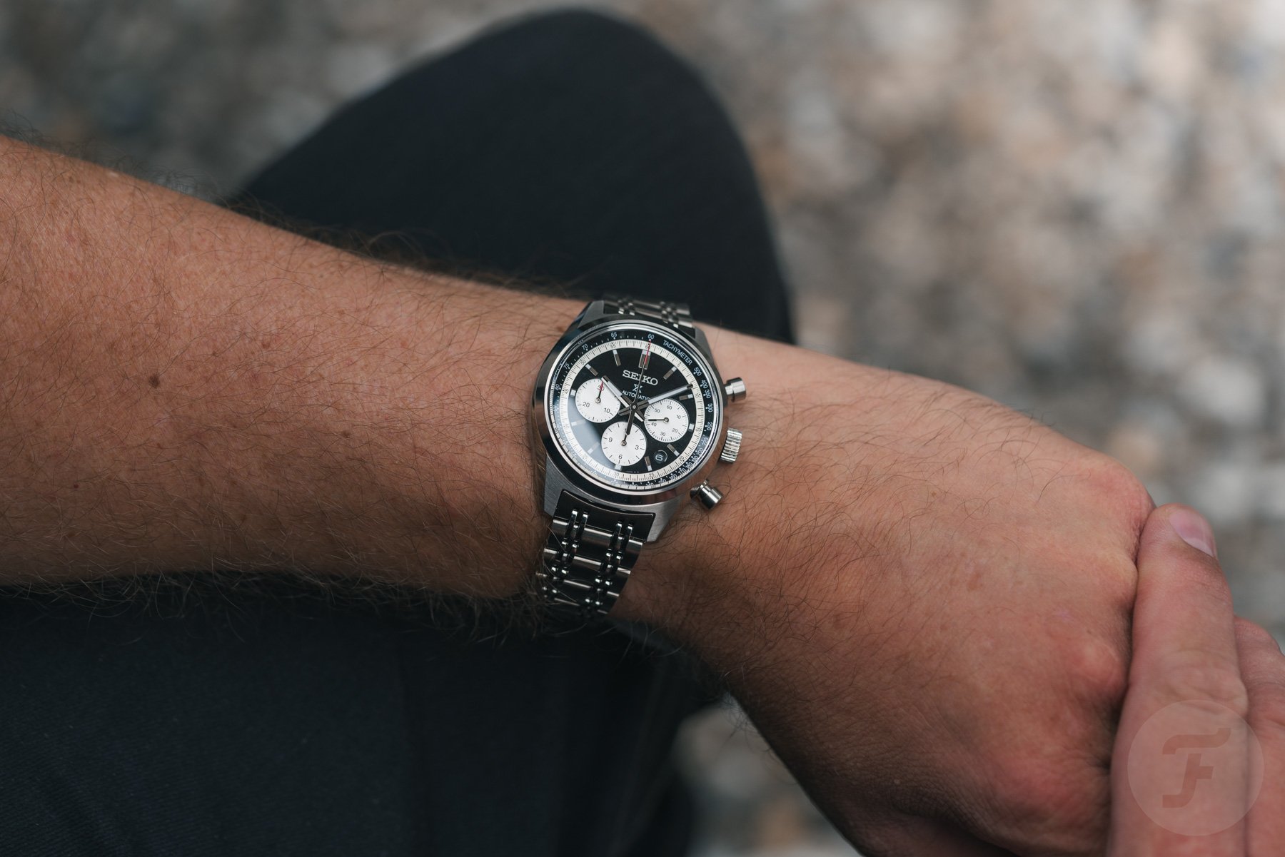
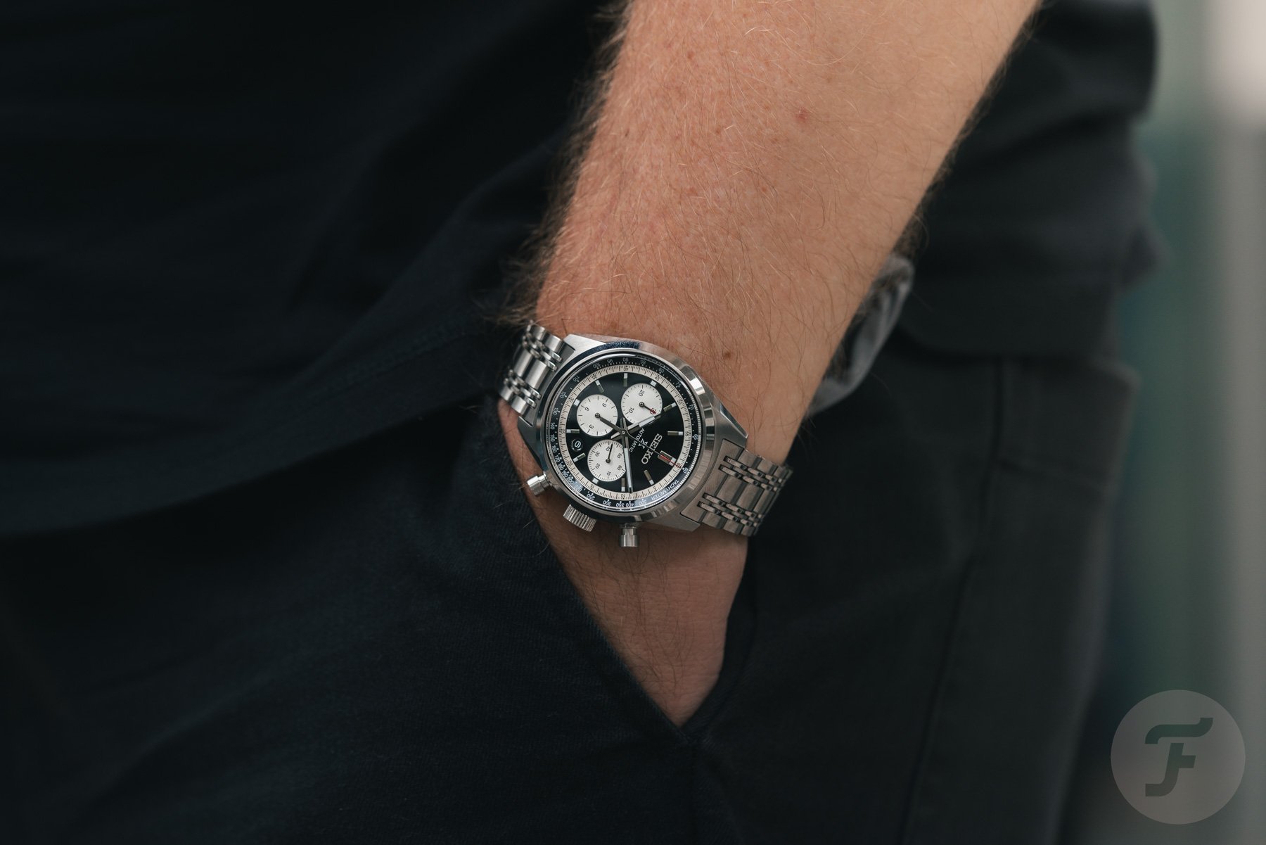
Both watches feature a three register layout with a sub-seconds at 3 o’clock, a chronograph hour counter at 6 o’clock, and a 30-minute counter at 9 o’clock. There is a date window between the 4 and 5 o’clock markers. No doubt some people will dislike this, but I like how it’s very understated in appearance and only stands out when needed. There are some pretty nice details in terms of color and finish.
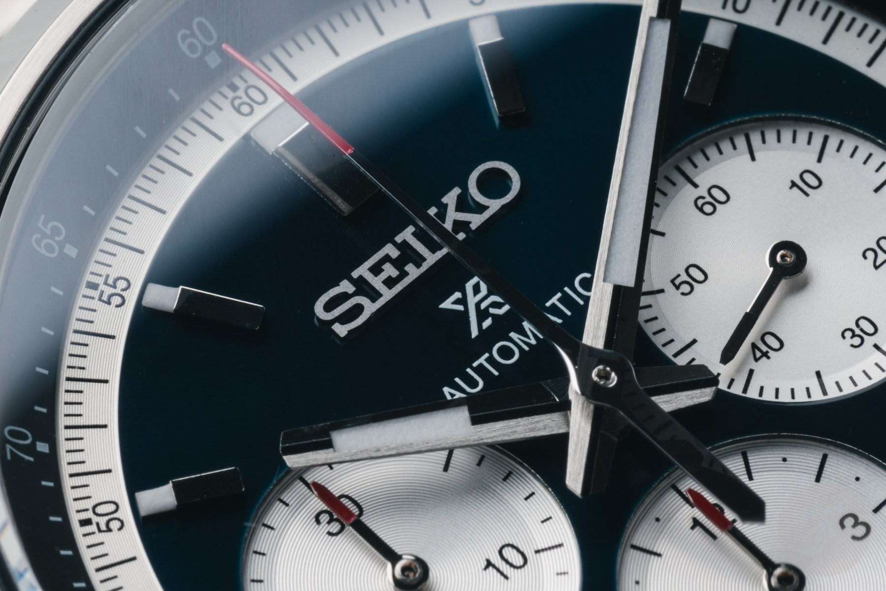
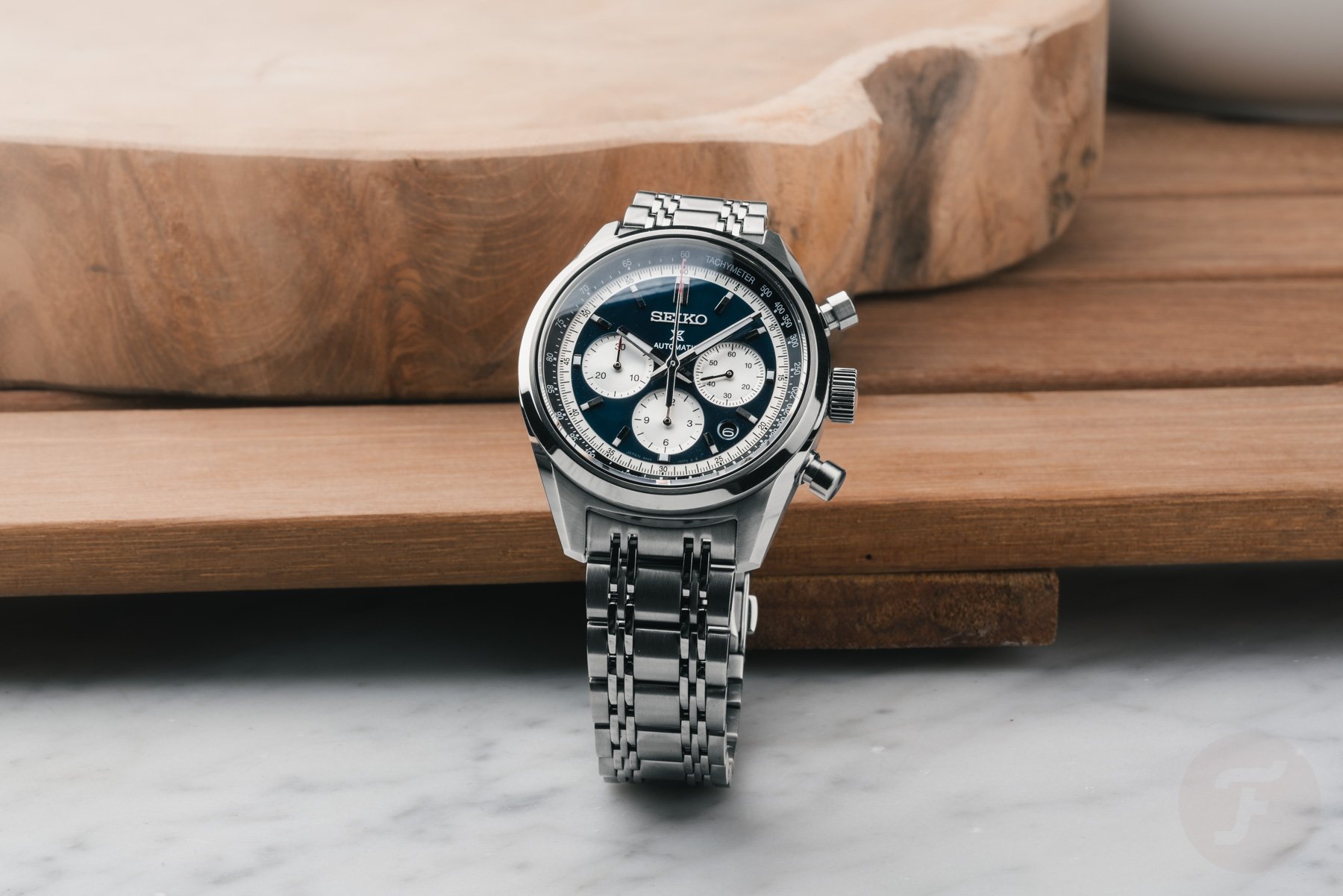
The SRQ051 features a dark blue dial with applied indexes, silver registers, and a silver chapter ring that holds a black seconds track. The tachymeter scale is rehauted and printed in white on a black background. Look closely and you’ll see the attention to detail in the concentric graining on the two chronograph registers and chapter ring. The SRQ053 has the same dial layout and finish, but replaces the blue with a dark black.
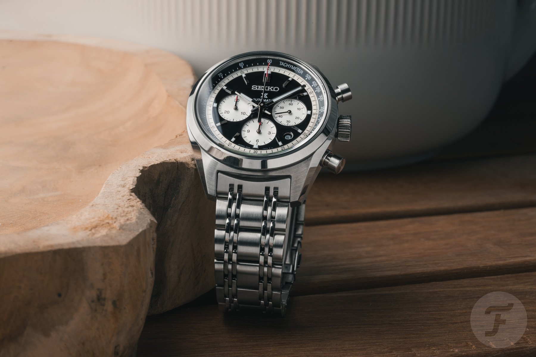
The black and silver dial is easier on the eyes, but I prefer the blue version because it feels a bit more stylish. It’s a nice dark blue, with silver subdials, a black rehaut, and a touch of red mixed in to make a very classy chronograph.
Seiko’s own caliber 8R48
Inside the case is Seiko’s in-house caliber 8R48. This automatic chronograph movement features a vertical clutch and column wheel for precise and tactile operation of the chronograph. The movement has a power reserve of 45 hours and is specified to be accurate to +25/-15 seconds per day. We all know that the margins specified by Seiko do not reflect reality; movements usually operate much more accurately than the official numbers indicate.
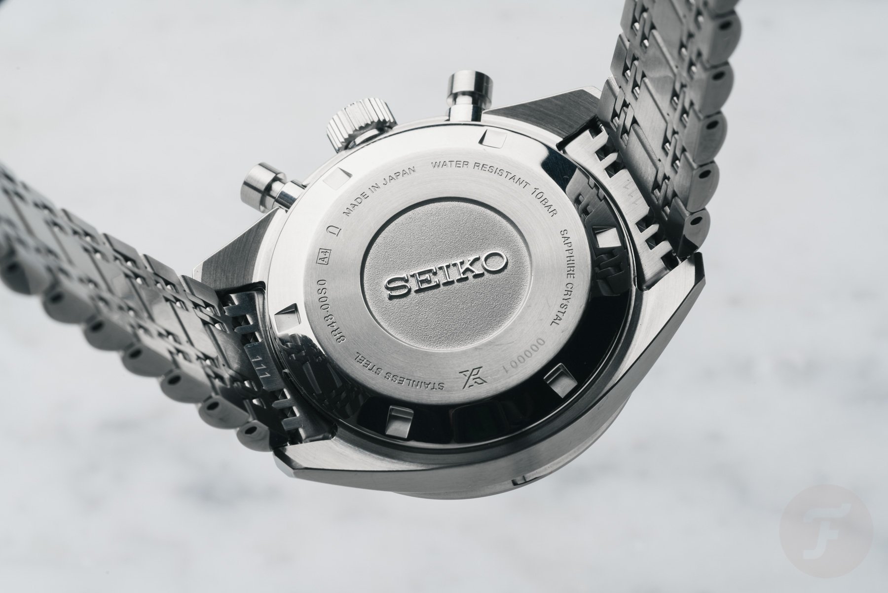
The movement sits behind a stainless steel screw-down caseback. There’s some basic information about the watch and a big Seiko logo in the center. It’s nothing flashy. But I don’t care. For me, the appeal of these watches is in the front, not the movement. The movement is a solid power train, though.
Wearing the Seiko Prospex Speedtimer SRQ051 and SRQ053
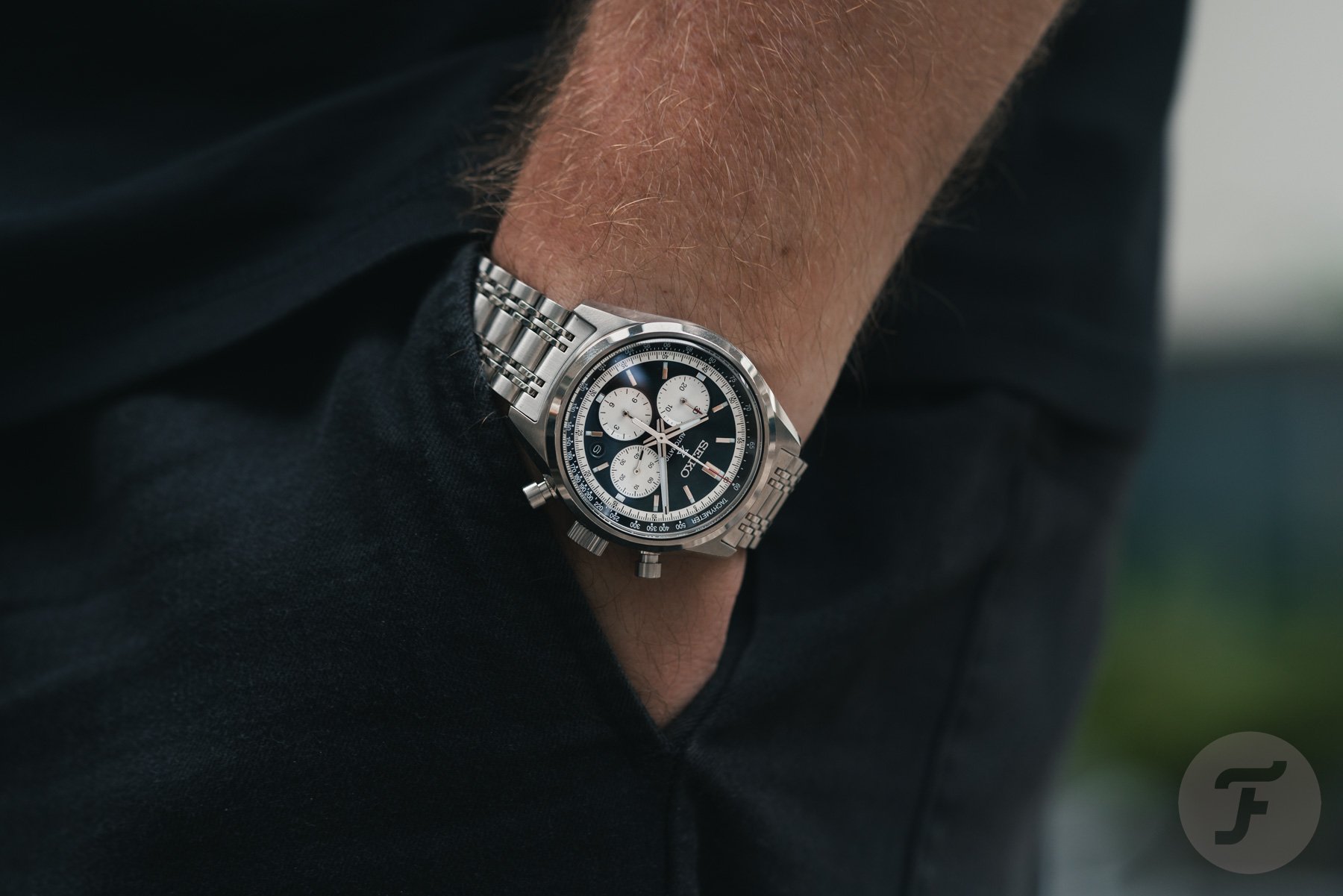
These two chronographs really shine on the wrist and you can see how perfectly balanced they are. Thomas mentions in his article his desire to see a smaller mechanical Seiko Speedtimer. While that desire is completely understandable, a smaller chronograph of the same thickness would look very bulky.
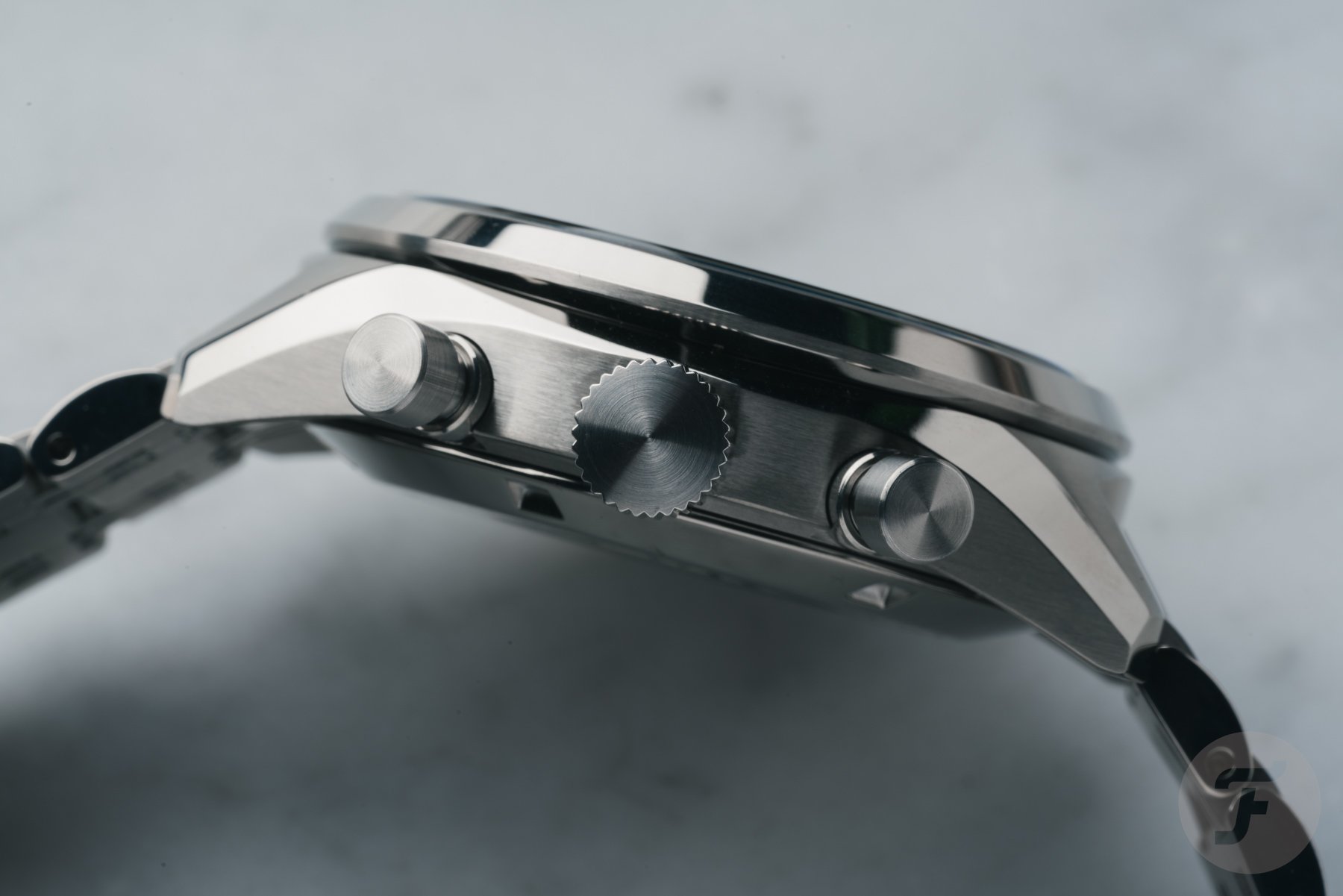
I think Seiko has nailed it with the current size of this watch: at 42mm, the chronograph fits my wrist perfectly, and while it’s certainly a slim watch, it’s not too chunky for its diameter.
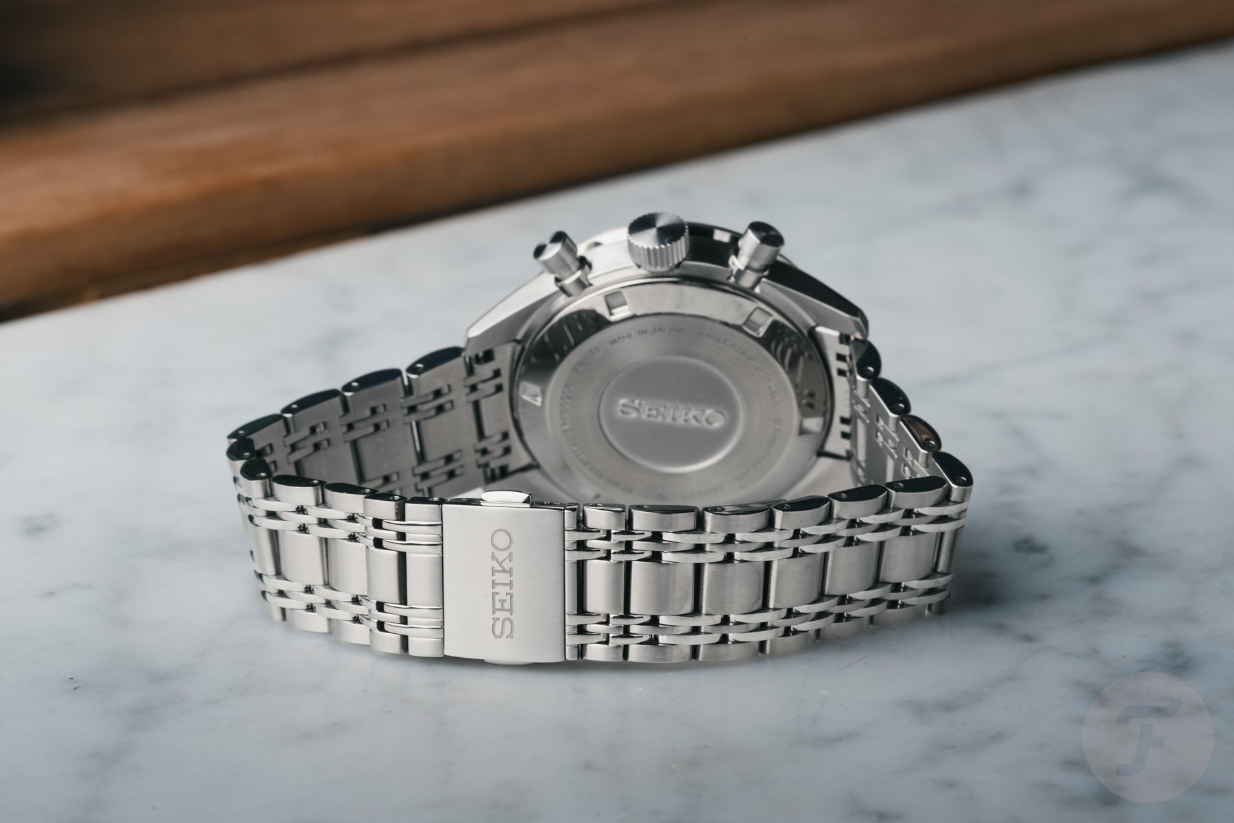
The thing is, these chronographs have a retro style, yet feel like thoroughly modern watches, which I love. If you want to combine quintessential 70s style with a modern finish, the SRQ051 and SRQ053 are great choices.
Another thing I like about these speed timers is the balance of the dial design. Although some might argue about the placement of the date window, all the different elements fit together nicely. As I said, the date blends in perfectly, so I’m happy with the current design solution.
Final Thoughts on the Seiko Prospex Speedtimer SRQ051 and SRQ053
From the case to the bracelet to the movement, every part of the Seiko Prospex Speedtimer is well-built and certainly better than lower-priced Seiko Prospex models. This is to be expected, given the 2,700 euro price tag of the SRQ051 and SRQ053. However, for what you get, the price is not exorbitant. It’s a significant amount, to be sure, but not many brands can offer in-house chronographs at a similar price.
Now, while I really like these two new watches, there are a few things I wish they’d been treated differently. You’ll never see it, but it doesn’t hurt to mention it. First, it’s weird to see the Prospex logo on a vintage-inspired chronograph series. Style is up for debate, but to me it’s also a dive-related logo. So it’s always a bit odd to see the “X” on a Speedtimer or Alpinist model.

I also think Seiko could win over some fans with smaller, thinner mechanical Speedtimer chronographs. Adding a thinner case 39-40mm version would make the Speedtimer series more appealing to a wider audience. Whether or not that will happen, however, doesn’t take away from the value of the excellent Seiko Prospex Speedtimer SRQ051 and SRQ053.
The Seiko Speedtimer SRQ051 and SRQ053 will be available at Seiko boutiques and select retailers worldwide starting October 1, 2024. What do you think of this new Seiko Speedtimer chronograph? Let us know in the comments below.
